UX Case Study
Notiive
Revolutionizing online learning with a community-centric platform.

✦ Background
In traditional academic models, lectures, reading, and note-taking have typically been the norm. Nevertheless, studies show that people effectively retain skills and knowledge through more tactile and engaging methods, such as hands-on practice, discussions, demonstrations, and teaching others what they have just learned. *Source: National Training Laboratories Institute for Applied Behavioral Science (NTL)
✦ The Challenge
Design an end-to-end application addressing the concept of learning new skills. When it comes to taking on such an endeavor, some online platforms may employ less effective learning styles and may not cater directly to diverse learning preferences. According to preliminary research, many users may disengage due to a lack of accountability, motivation, or visible progress.
In the ever-evolving landscape of education, one unchanging truth remains: Every learner is unique...
Given the current state of technology, there is an abundance of stimuli and a wealth of platforms and resources available for learning new skills online. Many students tend to have their preferred methods for learning most effectively, and we seek to acquire new skills for a multitude of reasons. In this comprehensive project, I set out to more clearly understand the needs and pain points of users and to build an online learning platform that accommodates this vast diversity.
✦ Scope & Process


73
300+
37
Research
✦ Goals
I aimed to comprehensively explore effective learning methods, reasons for early discontinuation, strategies to support course completion, evaluation and measurement of learning achievements, and the impact of sharing newfound knowledge. This approach would hopefully uncover diverse insights into learning behaviors, barriers, and ways to create a supportive learning environment, ultimately contributing to a holistic understanding of the user learning experience.
✦ Objectives
I sought to uncover why individuals seek to learn new skills, the prevalent types of skills they pursue, the tools and resources they currently use, their preferred learning methods, how learning integrates into their daily lives, the factors contributing to sustained motivation, and the reasons causing users to discontinue their learning.
✦ Methodology
To obtain qualitative insights, user interviews were conducted. Eight participants ranging from their mid 20s to early 40s were interviewed remotely. All users had previous experience with and a genuine curiosity for online learning. For additional data, a competitor analysis of four existing platforms was performed to identify opportunities in current strengths and weaknesses.
✦ Synthesis: Observed Patterns Through Affinity Mapping
✅ Positive Motivations:
+ Professional ambitions
+ Creativity / self expression
+ Strong presence of community
+ Close relationships
+ Achievements and positive feedback
+ The end goal
+ Knowing that “it will eventually click"
❌ Common Drawbacks:
- Time commitments
- Handling negative feelings
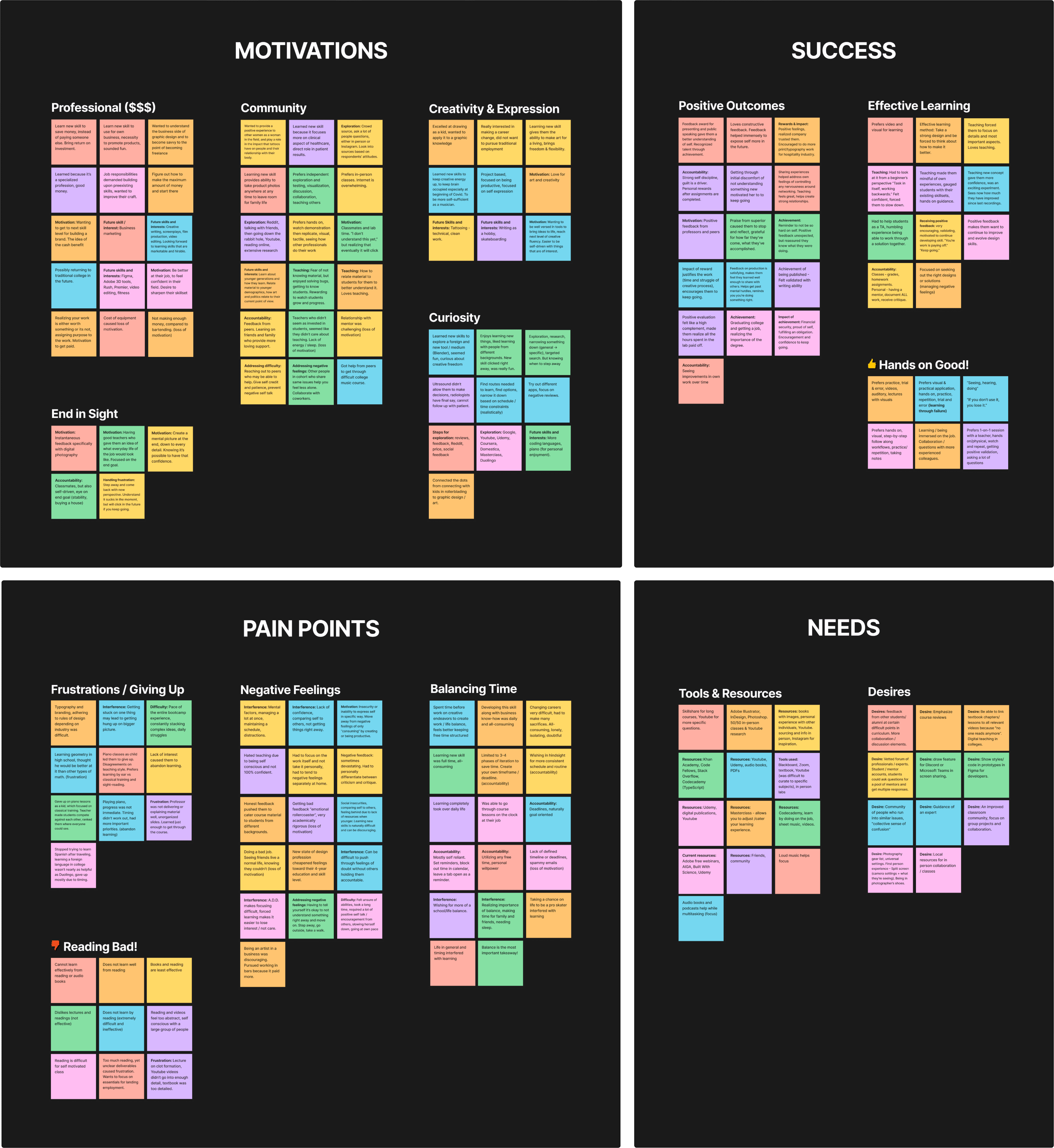
✦
What We Learned

Define
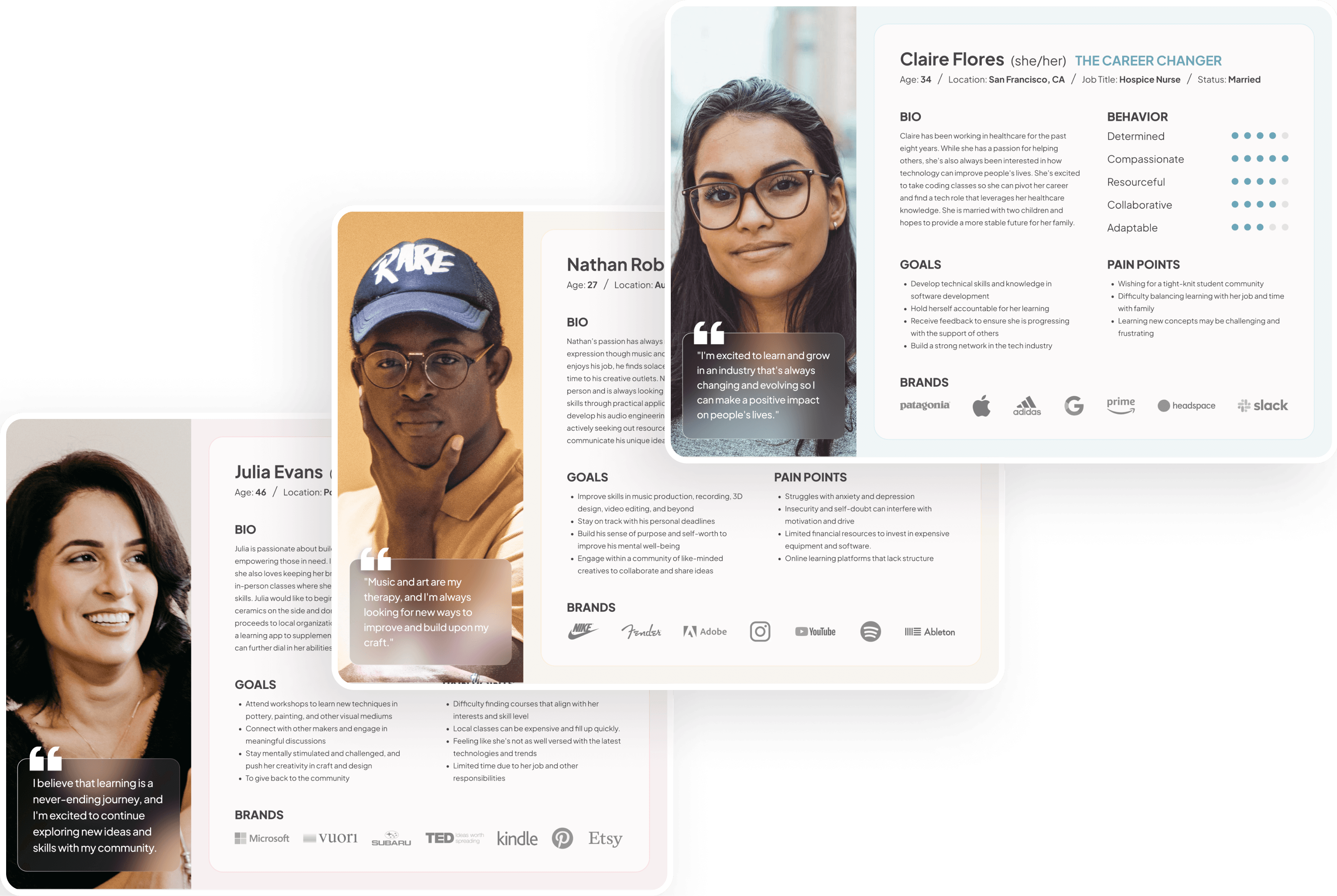
✦ User Personas
Through the creation of user personas, I was able draw from my research synthesis to identify unique goals, pain points, and behaviors across a number of archetypes. This served as a jumping off point for all platform ideation that would follow.
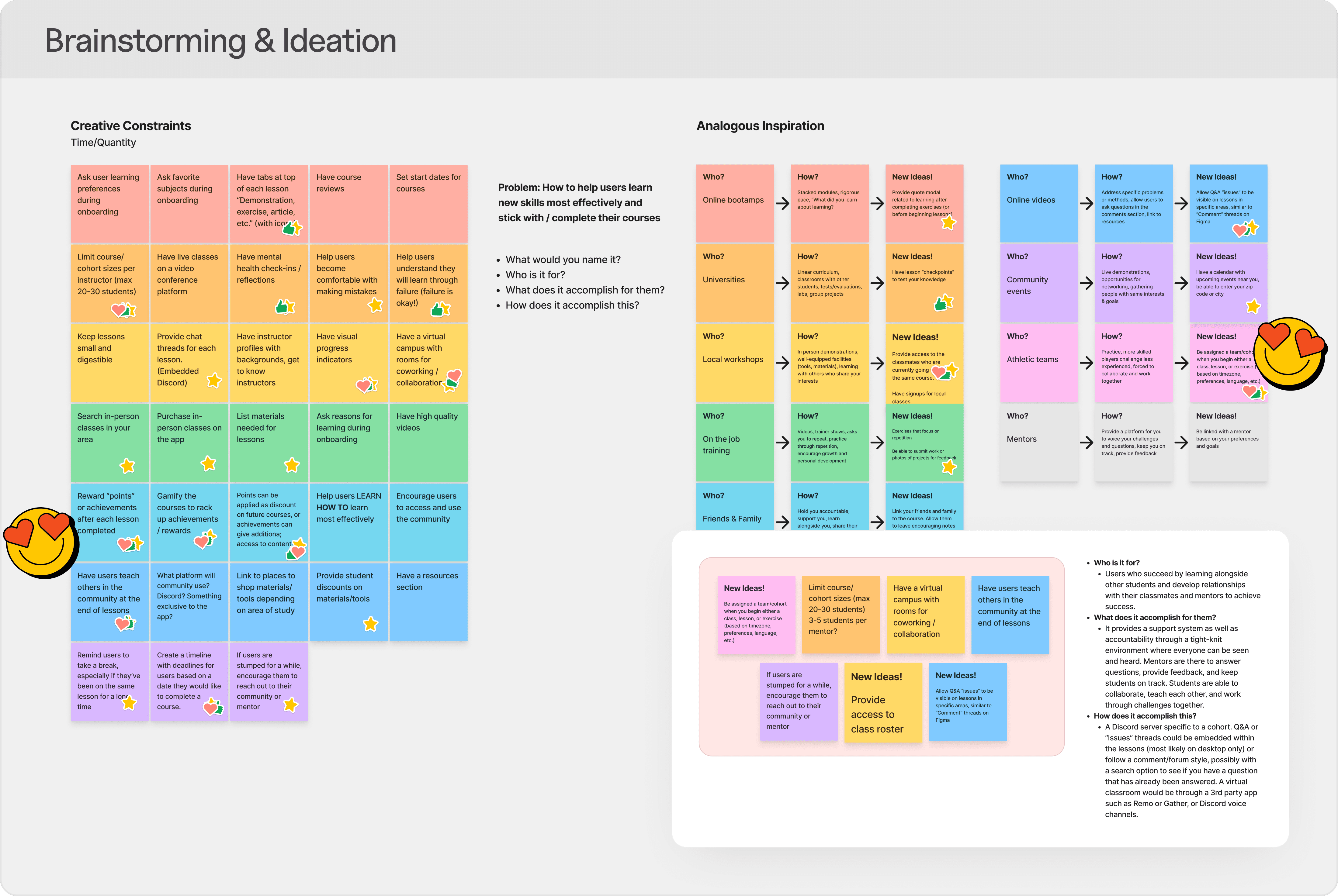
✦ Ideation
In order to develop impactful ideas, I opted for using a number of brainstorming techniques. This was crucial for visualizing the problems to be solved in order to align project goals and establish priorities that would achieve a minimum viable product.
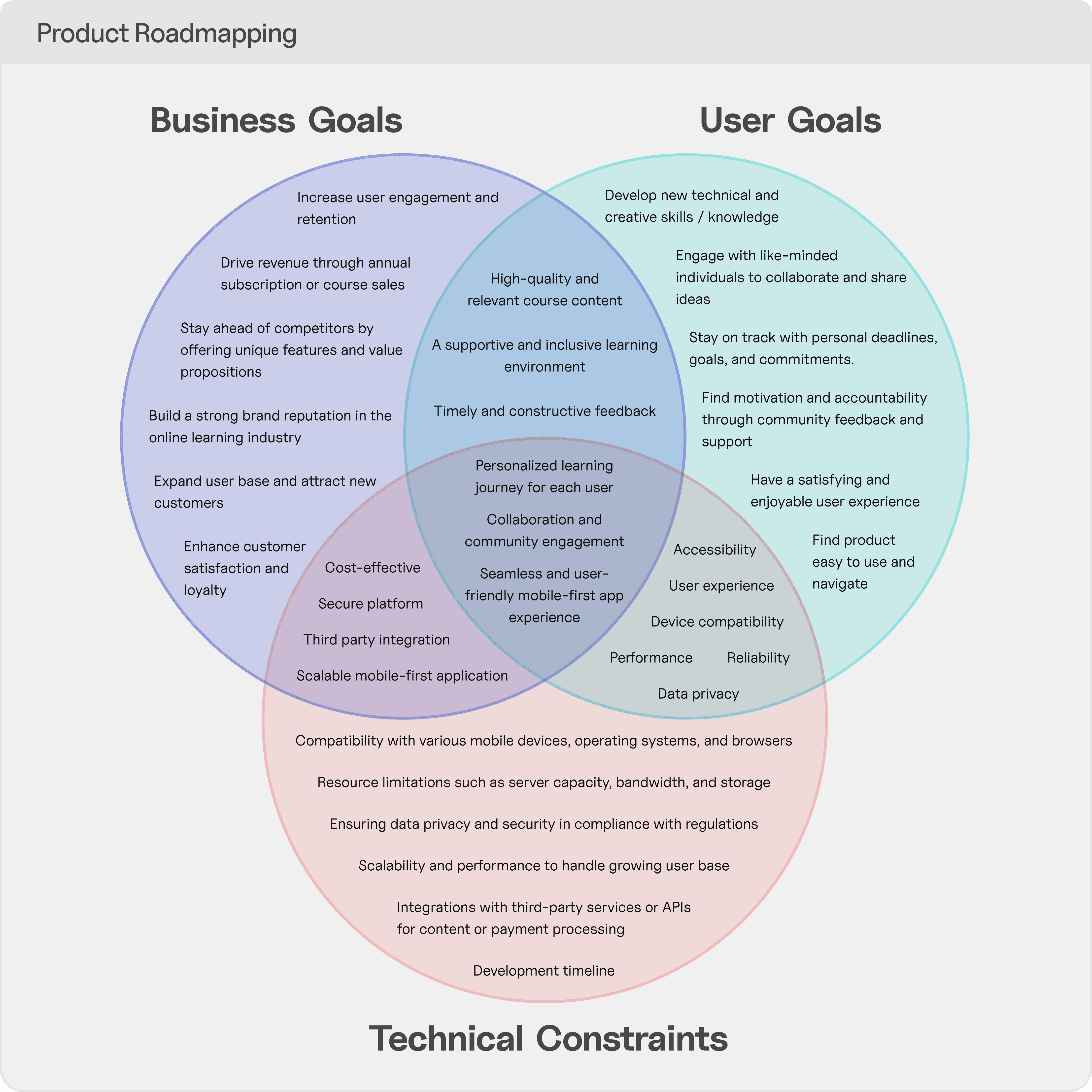
✦ Prioritization
⏱️ Features Required for Minimum Viable Product
Visitor course browsing - search and filter
User registration and authentication
Course catalog - divided by category
Provide course dates, enrollment deadlines, and timelines
Course enrollment and checkout process
Lesson content - videos, demonstrations, interactive exercises
Social features - cohorts, discussions, direct messaging
Course progress tracking
Short, digestible lessons
✦ Information Architecture
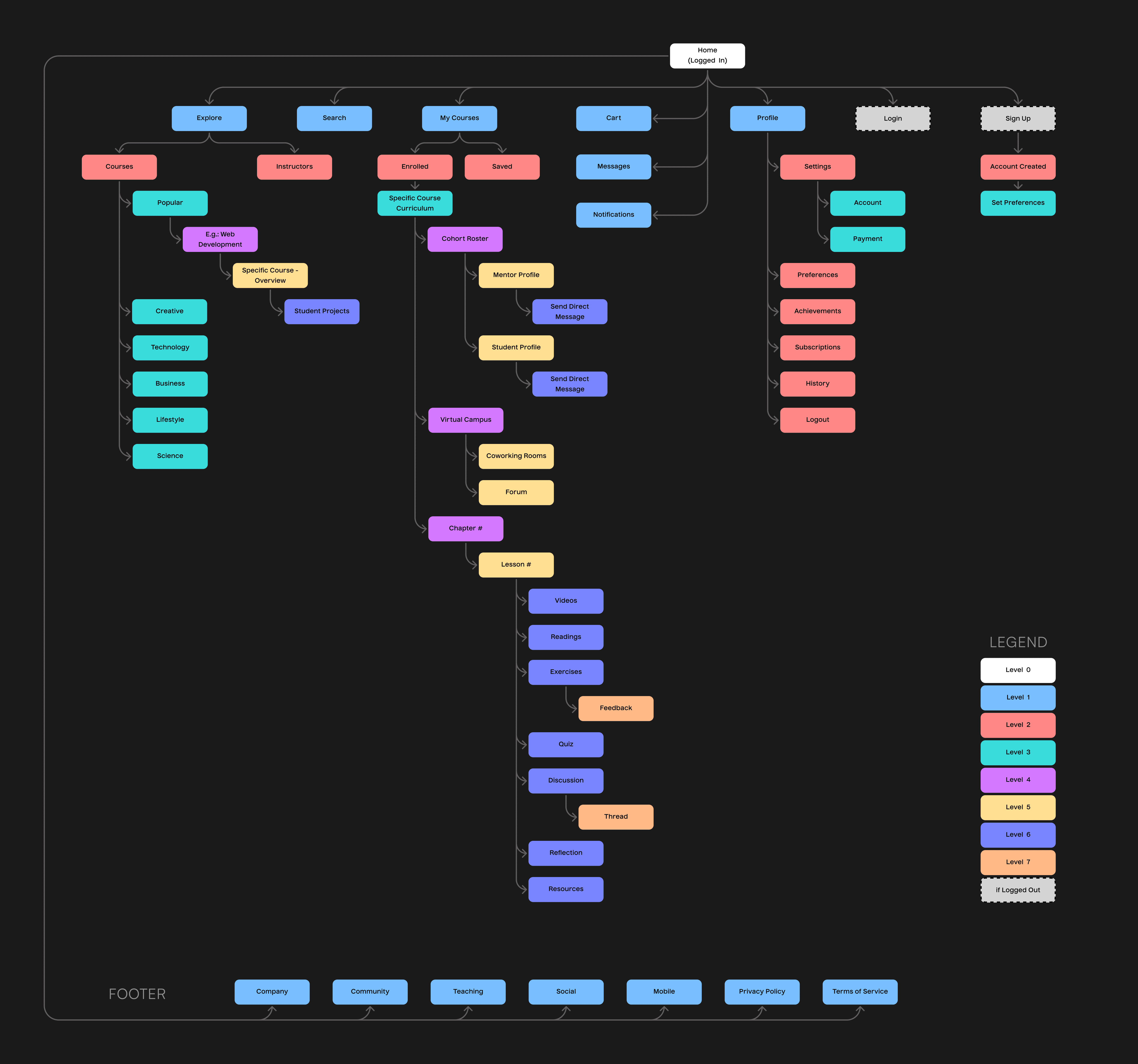
🧱 Sitemap & Navigation
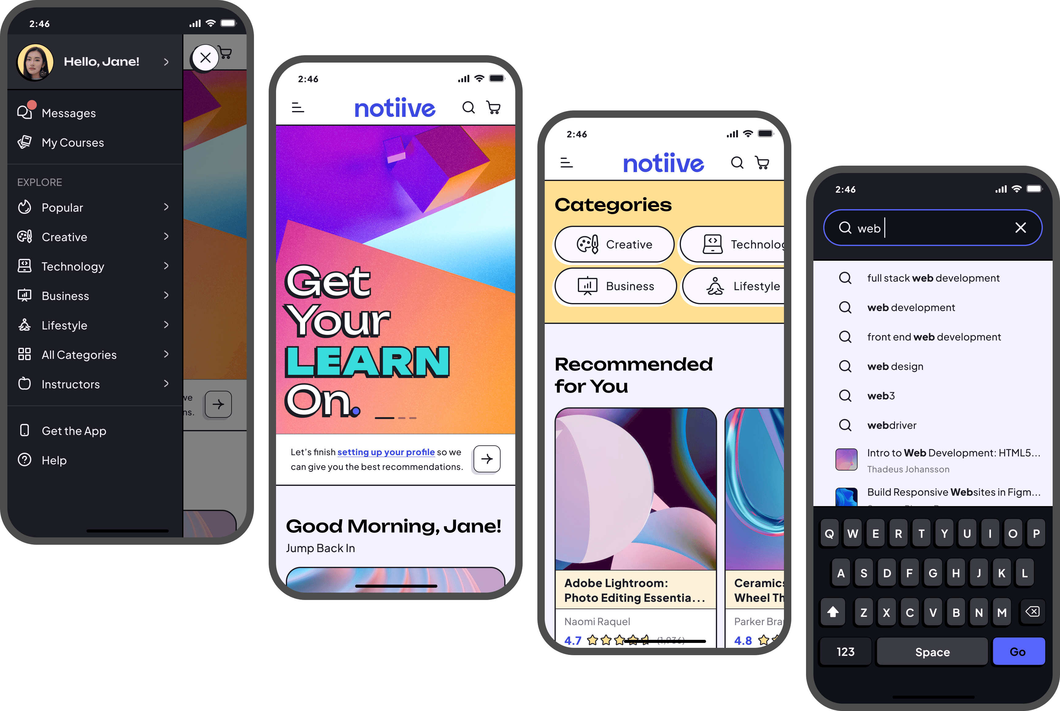
Because the platform would consist of a wide array of courses uploaded by instructors, the core of the navigation from the home screen would operate by implementing e-commerce patterns to enable learners to browse and filter courses to best suit their needs. A deep navigation menu would accommodate exploration.
A student dashboard for active courses would keep users organized with their curriculums, projects, and classmates. While a remote card sort was conducted early on with 10 participants, this initial sitemap saw iterations over the span of the design phase as flows became more clear.
Design
✦ Interaction Design
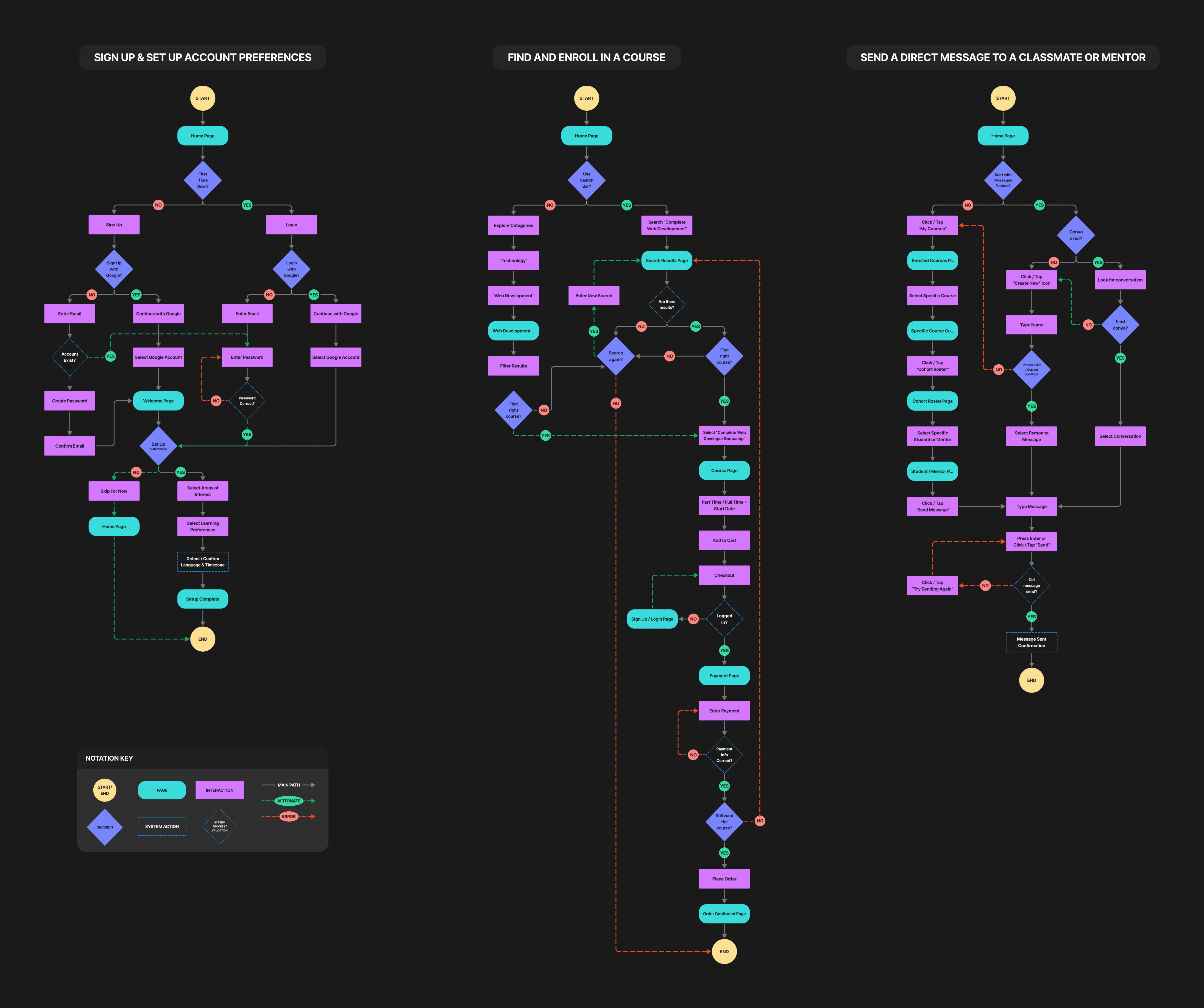
🔷 User Flows
Multiple flows within a larger journey were created to show multiple paths of locating a course, going through the checkout process, and utilizing the direct messaging feature. Both system and user errors were taken into account to illustrate detailed edge cases within all interactions.
Sketching and wireframing was a very iterative process, with many design options and elements not making the cut to the next phase. This was based on early user critiques and feedback, where some patterns felt more natural and intuitive than others depending on the task at hand. Mid fidelity provided a strong direction for the more refined user interface that would follow.
✦ Sketches & Wireframes


✦ Responsive Design


✦ Brand Core Values
In order for wireframes to evolve into high fidelity, proper planning needed to be taken into account. I first set out to establish the appropriate core values that would capture the tone of the brand's identity. I settled on the following: Accessible, Bold, Curious, Expressive, Friendly, Modern, and Vibrant. This lended itself heavily for pursuing a direction in visual style.
✦ Gathering Inspiration Through Moodboarding
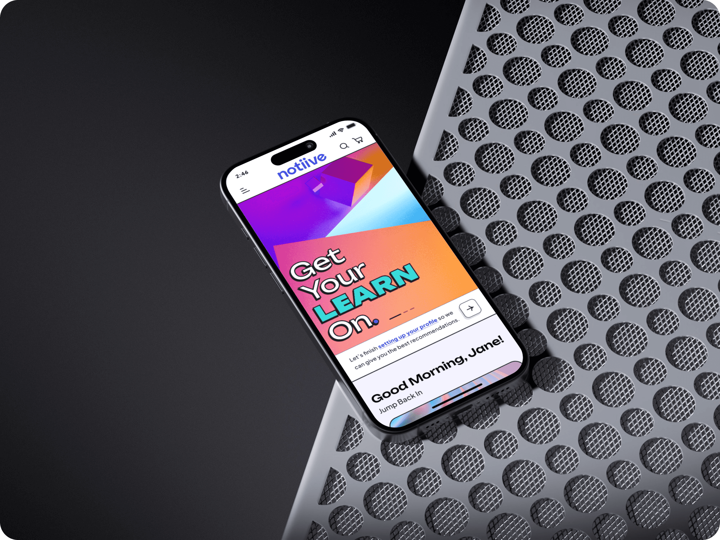
✦ Logo & Visual Identity
Settling on the brand's identity was another very iterative process. Research results showed that community was going to be a strong theme. As an educational platform focused on upskilling, I came up with the concept of a pinwheel composed of chat message bubbles (representing collaboration with peers and mentors).
The pinwheel is symbolic of childhood where learning and curiosity are a key part of development. A wheel itself also symbolizes forward motion, momentum, and progress. The name "Notiive" was derived from the combination of the words "notion" and "intuitive". The logo design was intended to be minimal and easily scalable.
✦ Component Library
The Outcome
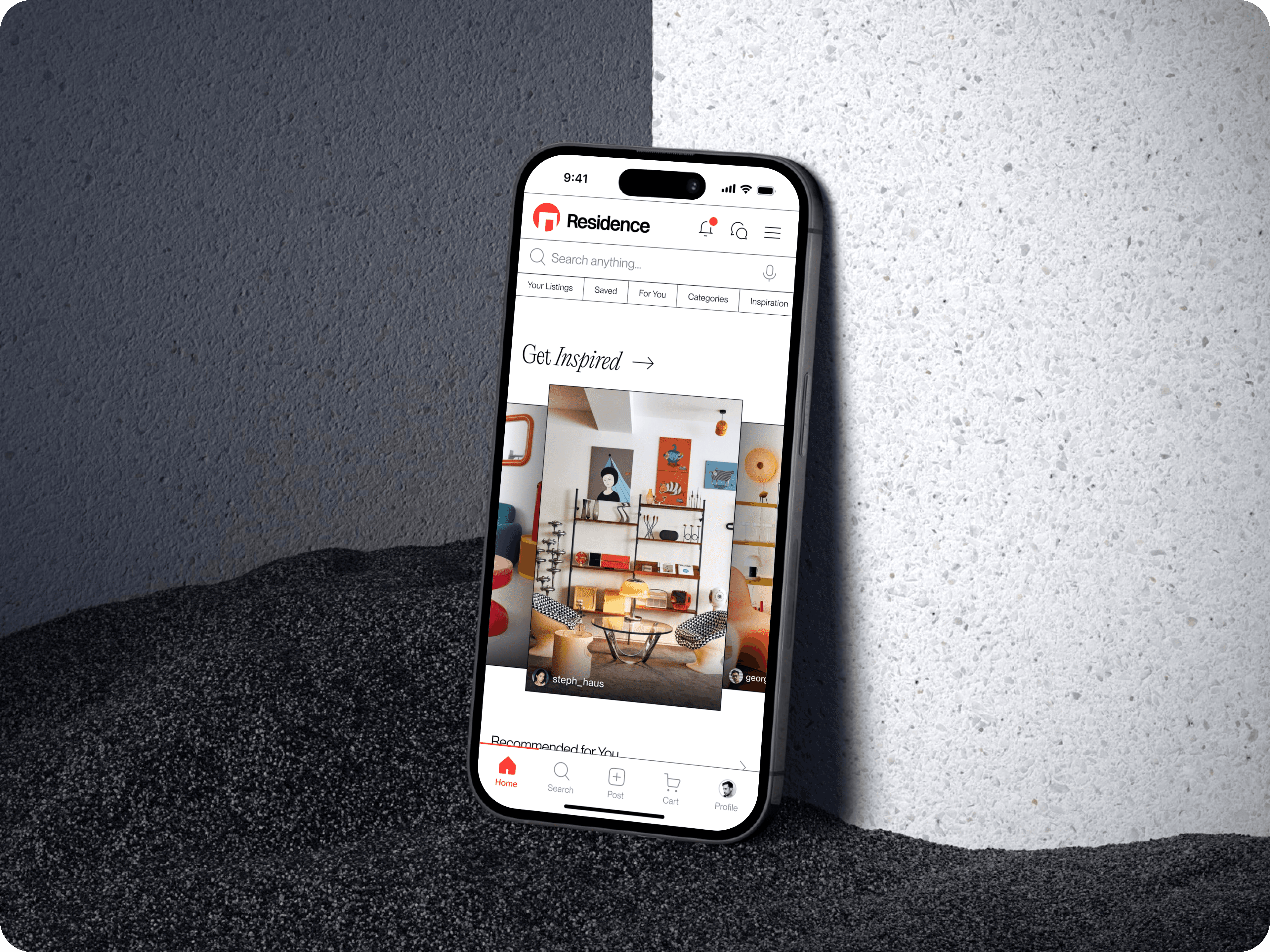
✦ Interactive Prototype
External link can be found here ↗︎. (Required on tablet and mobile.)
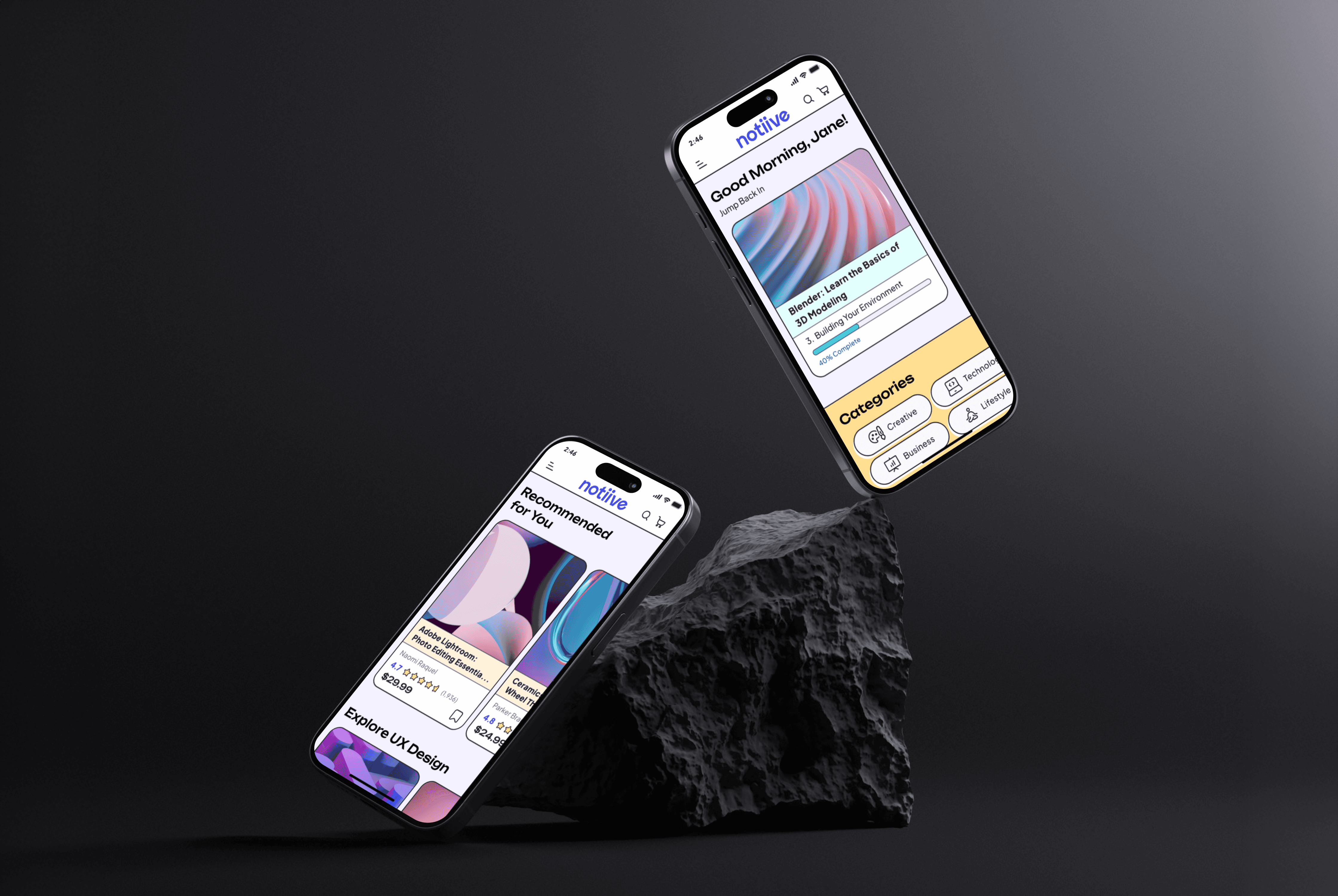
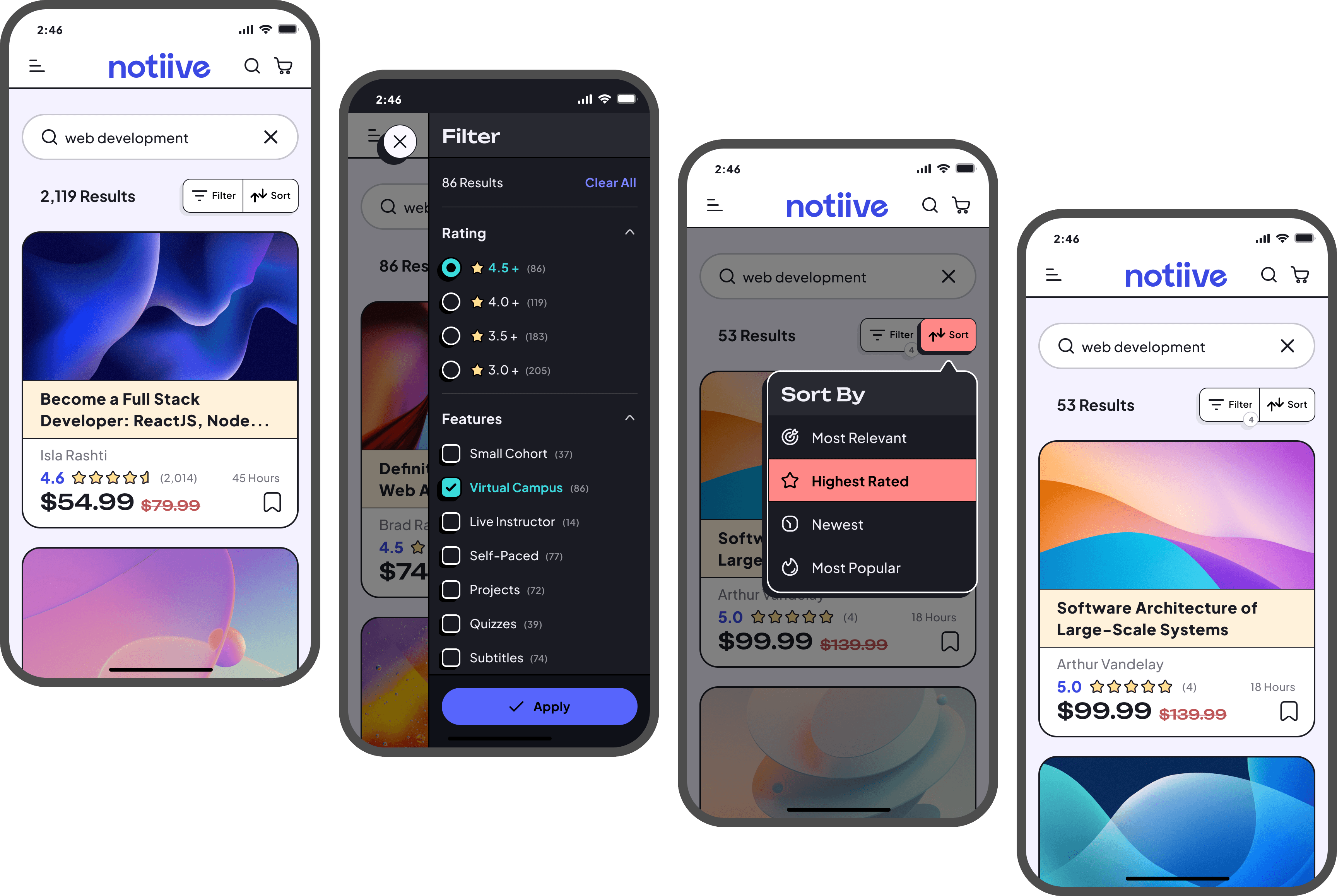
✦ Finding the Right Course
This flow covers the ability to either browse through categories or conduct a more specific search query. The goal of the task was to locate a specific course. A number of paths can be taken to arrive at the search results page. Filtering and sorting criteria for rating, features, skill level, and price were also provided during testing to showcase complex menu interactions.
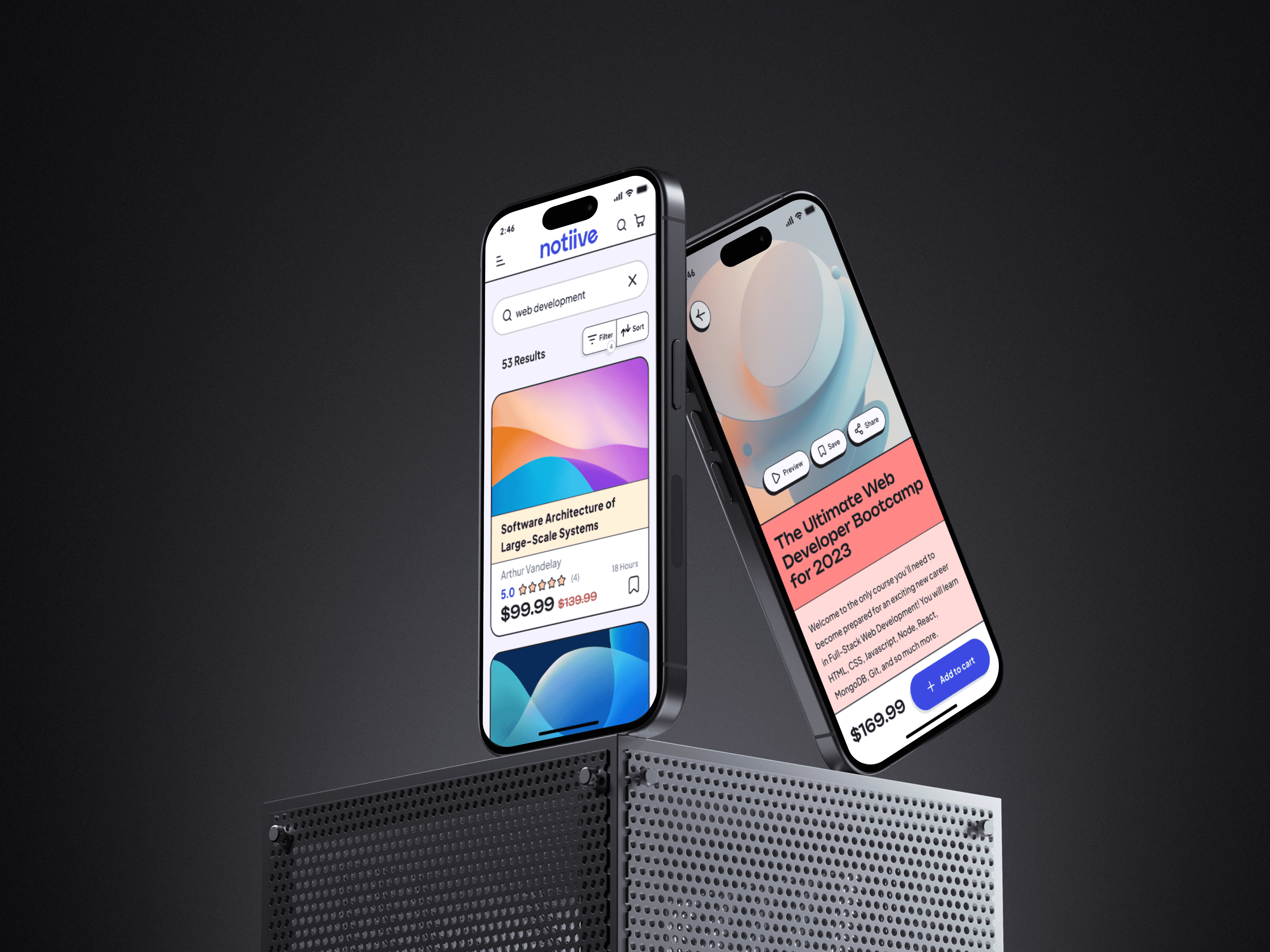
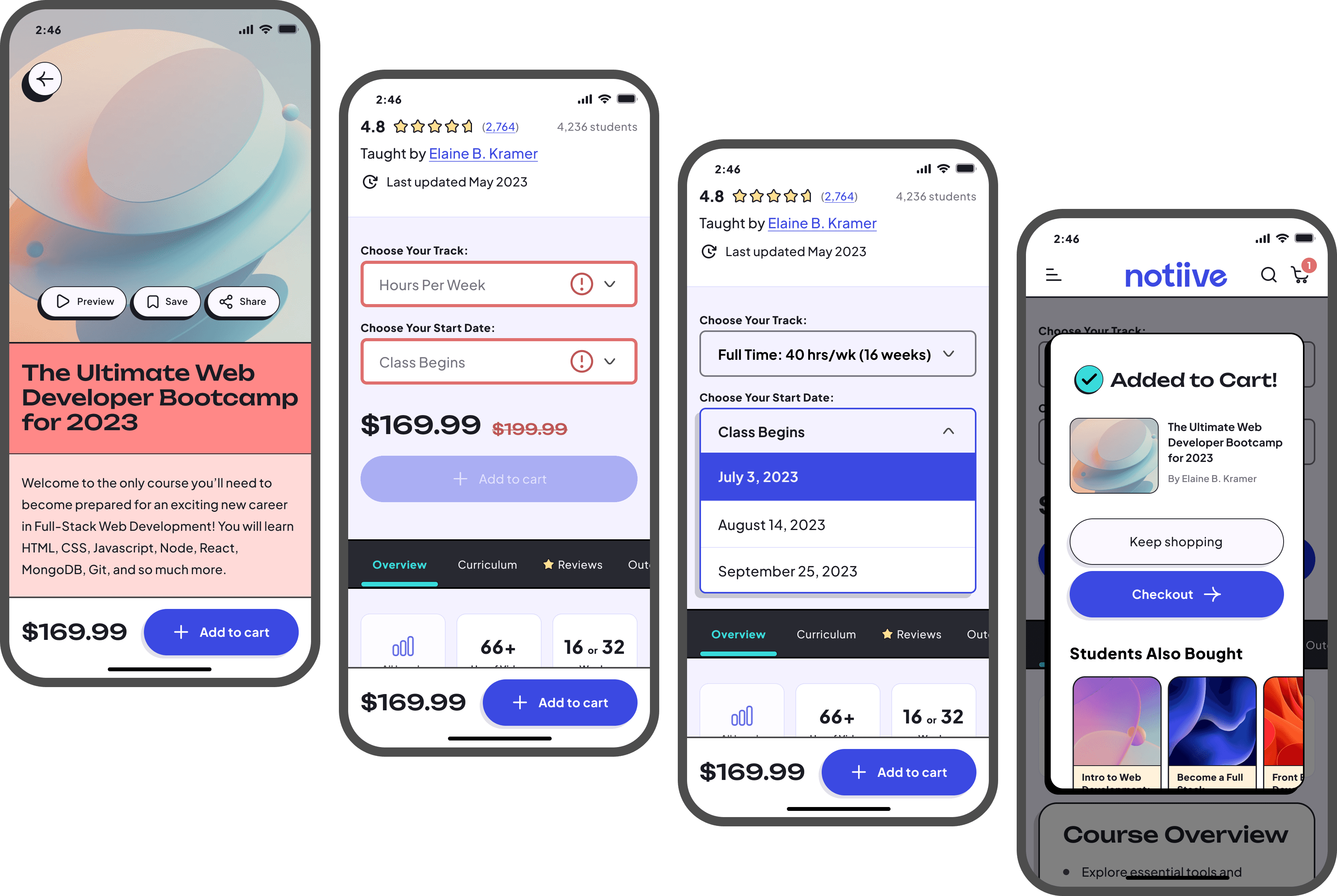
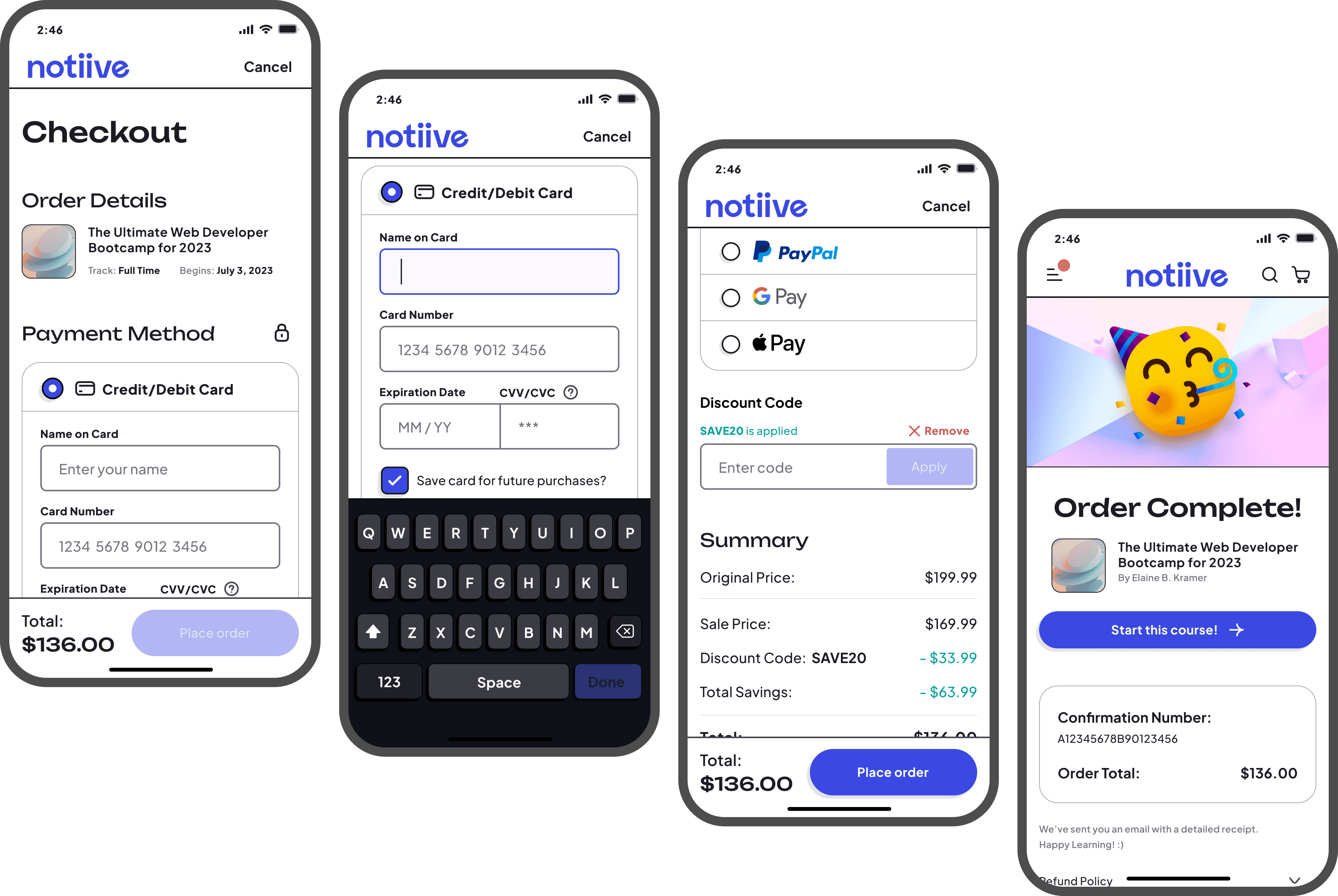
✦ Checkout Process
The course page gives a thorough overview of what students can expect from the curriculum, especially providing context to community features such as a virtual campus and lesson discussion forums. Required field states were used before one could advance. From here, the checkout process was straightforward and familiar, covering multiple payment options. Icon notifications also update as the flow progresses. The task concludes with a success message and receipt.
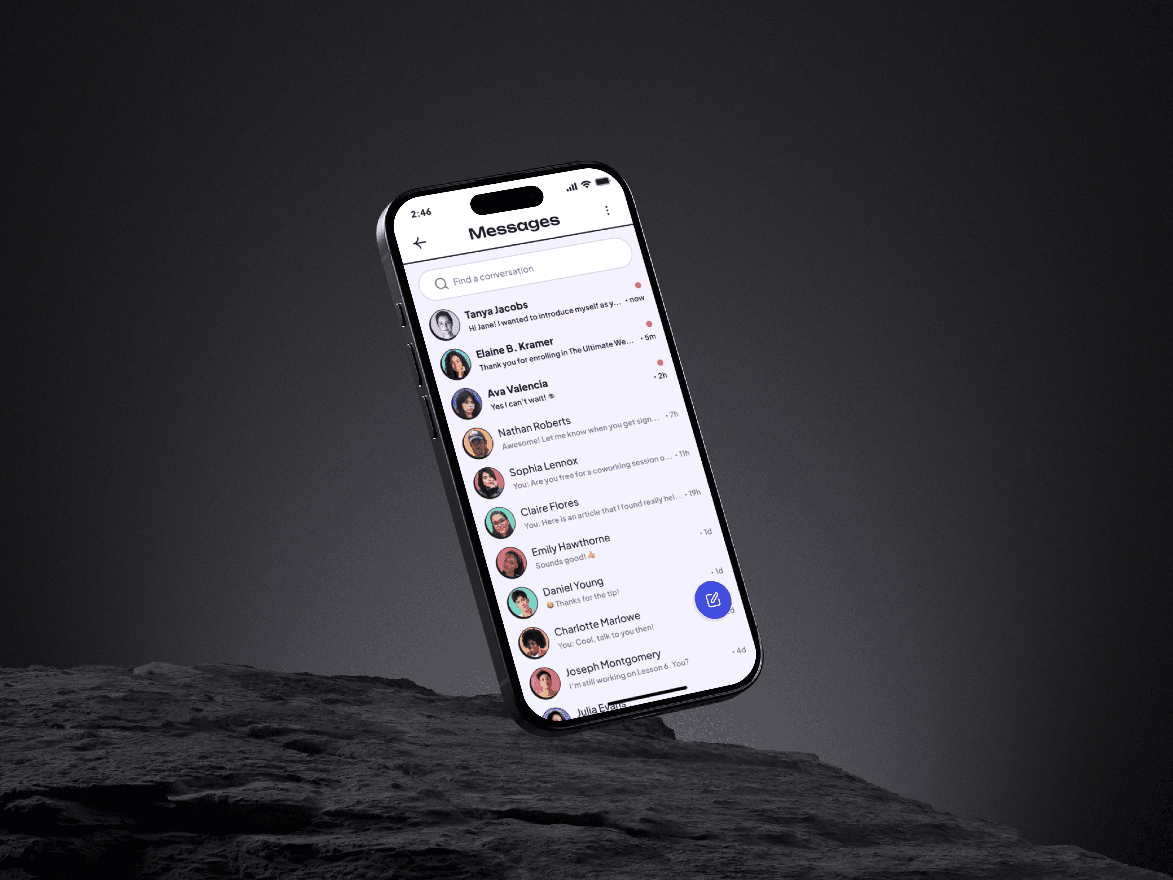
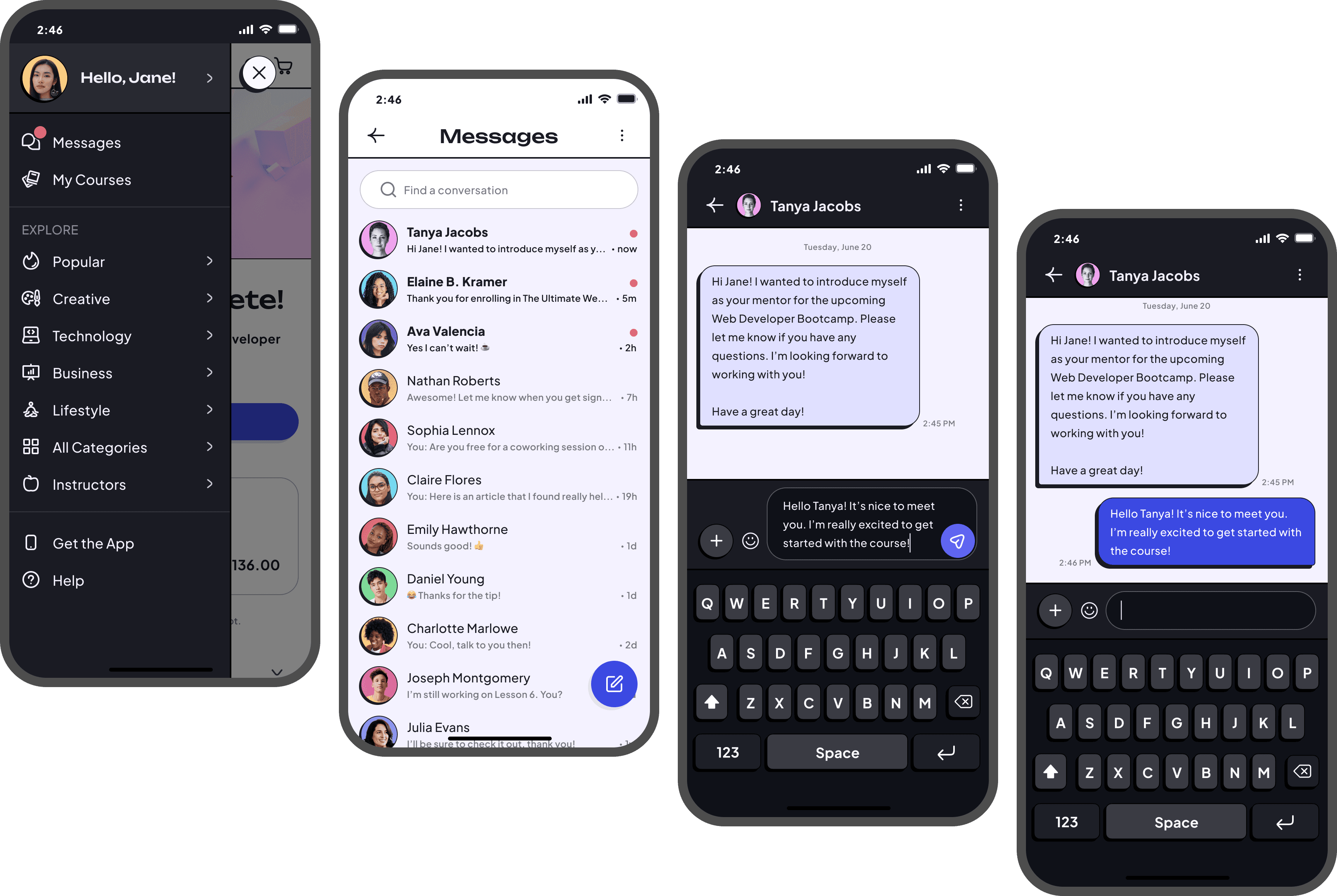
✦ Direct Messages
Once the course has been purchased successfully, the user receives a notification for a new direct message within the main menu. Here, students can access all their active conversations with peers, mentors, and instructors. The chat interface patterns are once again familiar, while also being tied into the brand with its high-contrast nuebrutalist aesthetic.
Test
✦ Usability Testing
Moderated usability testing was conducted using Maze in order to gather qualitative data and metrics based on user behaviors. These tests took place remotely where Vowel was the video conferencing software of choice. I was able to view the user’s screen as they interacted with the prototype and completed short tasks.
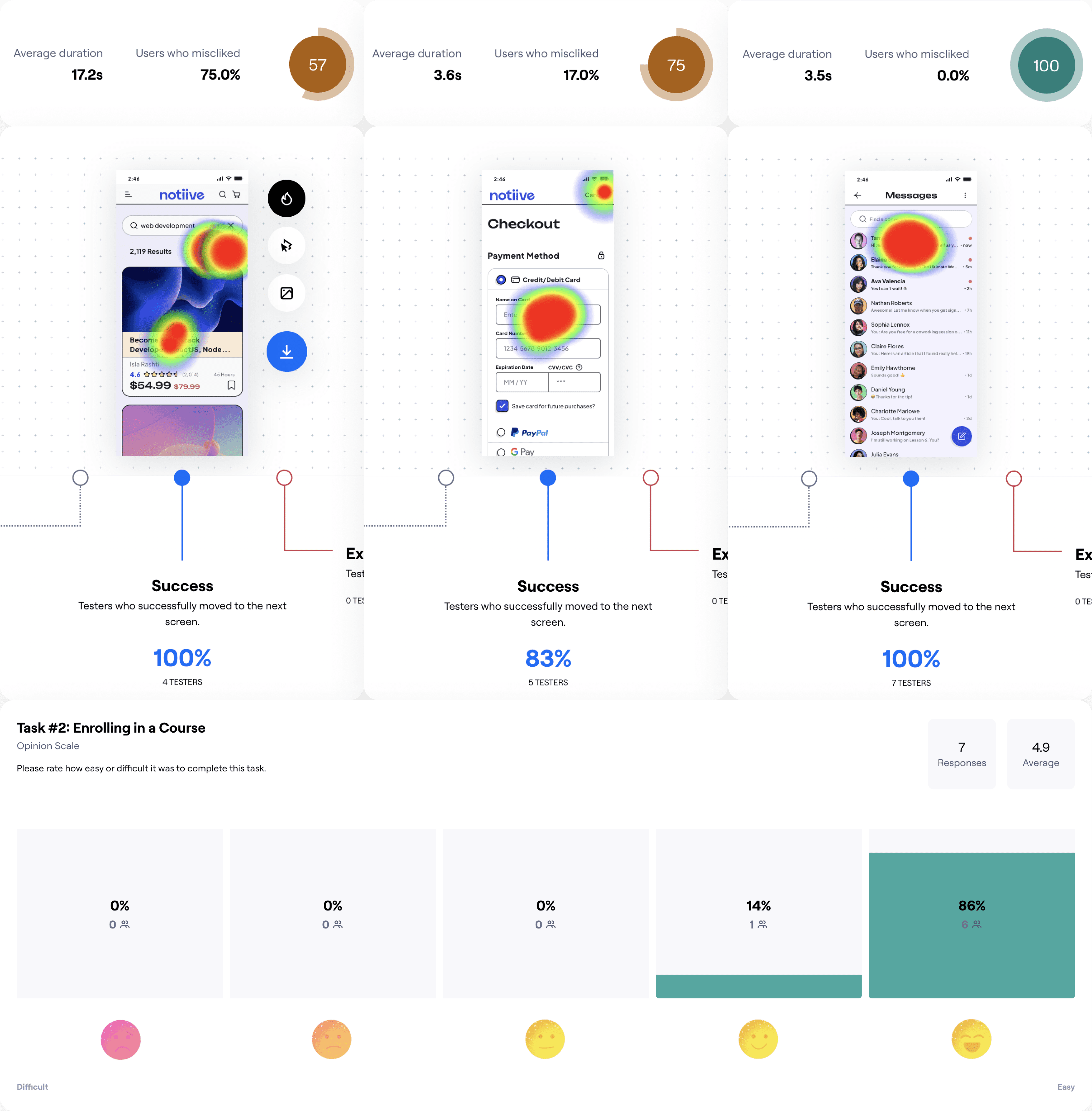
✦ Analyzing & Prioritizing Test Results
Through both qualitative insights and metrics, priority matrices were created in order to address the feasibility of iterations. These revisions would provide the most success for users to more efficiently complete tasks with less effort.
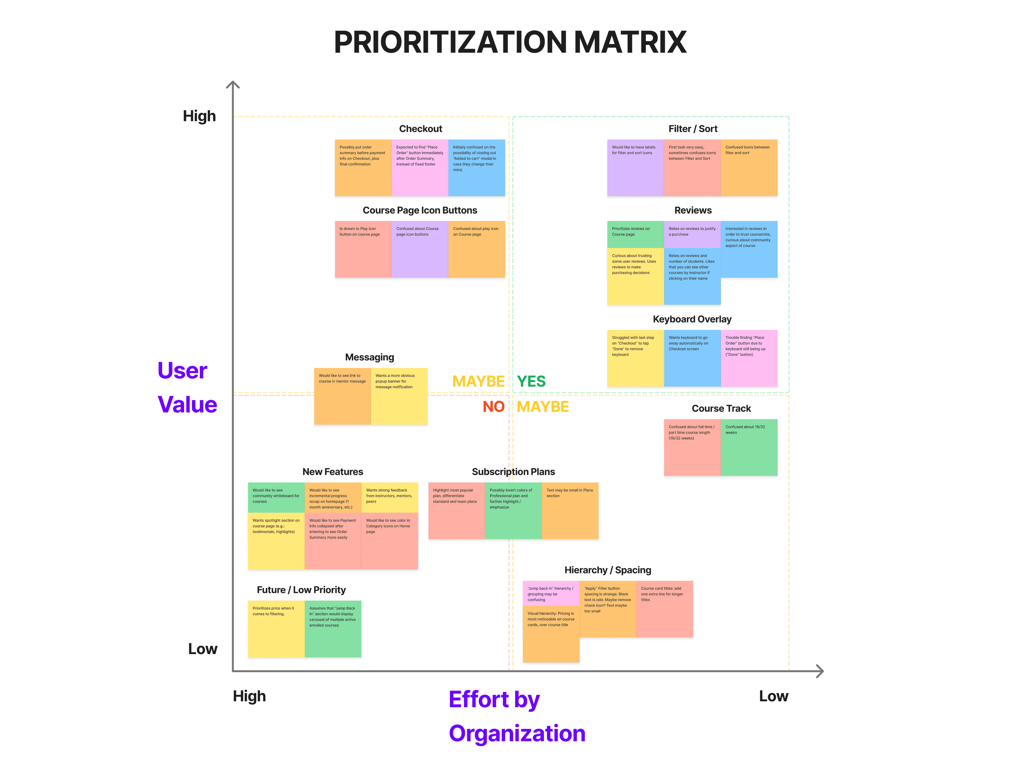
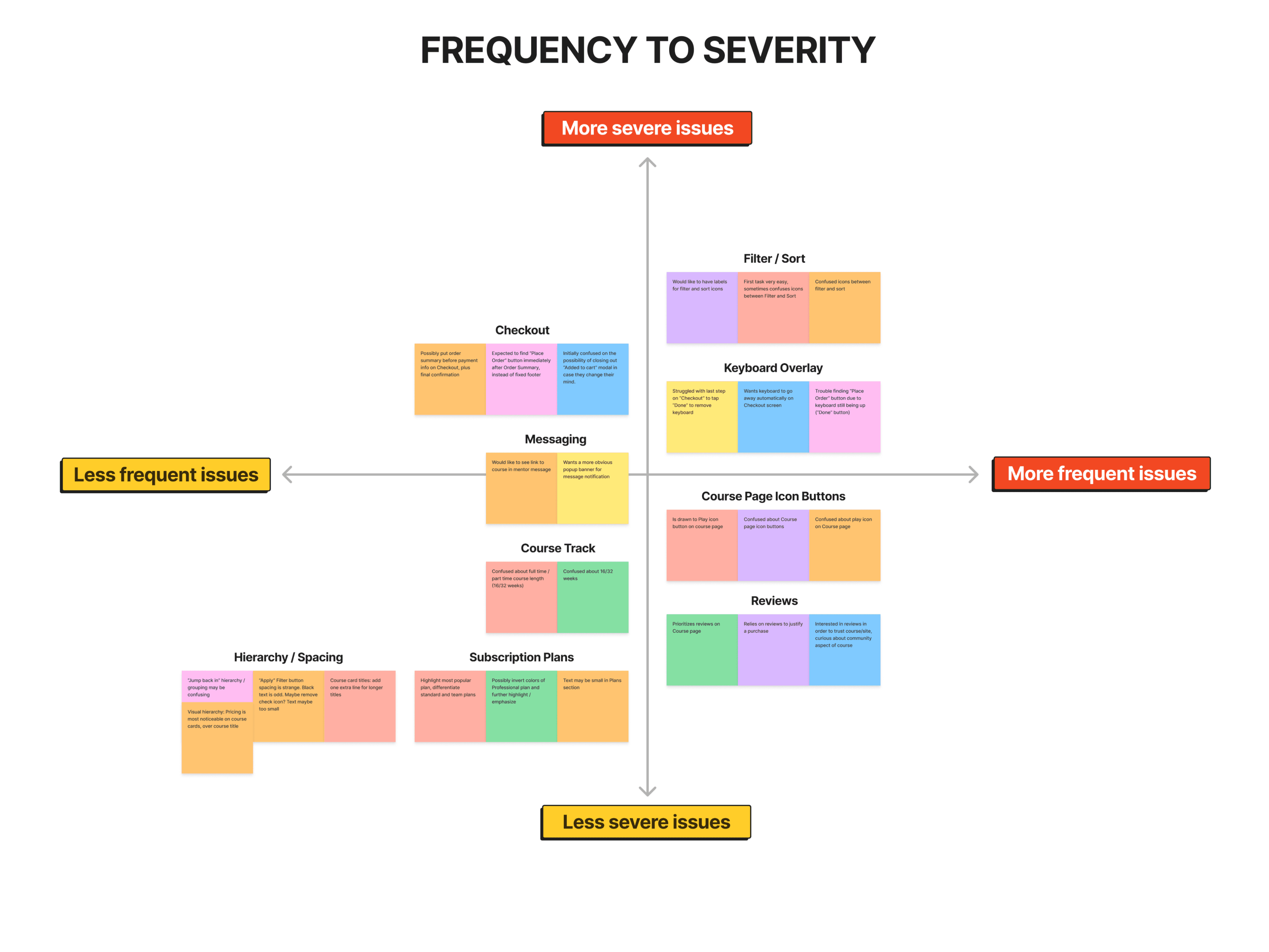
✦ Revise and Iterate


Wrapping Up
✦ Conclusion
This project initially set out to create a more inclusive and effective learning platform by understanding diverse learning preferences and improving engagement through structured learning and community support. Through research and iteration, I gained valuable insights into user motivation and the importance of accessible design in education to address a vast number of student needs to encourage successful outcomes. This was also an excellent exercise in rounding out my knowledge and practice of the entire end-to-end design process while adhering to strict timelines.
✦ Next Steps
In the future, my design plans for this project are as follows:
+ Onboarding and account setup
+ Curriculum interactions
+ Assignment uploading and feedback
+ Virtual campus
+ Lesson discussions
+ Student and mentor profiles
+ Full desktop platform
Notiive empowers students to successfully develop new skills for professional growth, creative pursuits, and personal fulfillment. With the concepts of community and building relationships at its core, the platform encourages collaboration and feedback to provide an effective learning experience for a multitude of preferences and styles.

Ryan Emmans 2024