UX Case Study
Improving content discovery through personalization within the browsing experience.

✦ Background
With over 2 billion monthly active users worldwide, Meta's Instagram has evolved into a social media behemoth, constantly balancing monetization and user satisfaction through new features and increased engagement. As someone who has been on and off the app since nearly its inception, I've watched it go through many changes over the years, introducing countless additions. Gone are the "good ol' days" of primarily sharing and viewing grainy overly-filtered photos with friends. Purchased by Facebook back in 2012, Instagram has primarily transformed into a model driven by advertising and profit, but that’s a conversation for another time.
✦ The Challenge
The challenge was to develop and add a feature which serves as a useful progression within the current ecosystem. While feeling familiar, it should enhance user control over content curation, allowing them to personalize their experience and avoid getting lost. The goal was to address frustrations around irrelevant content and offer a more seamless experience across different media formats within the app.
The main question I initially wanted to address was "What if we could more intentionally use this as a tool for inspiration and knowledge?"
This project sets out to address issues related to Instagram’s highly complex algorithms in regard to how content is prioritized based on user engagement. This can sometimes deliver content that is irrelevant or repetitive, negatively impacting the user experience. It is an easy app to get lost in, and not necessarily in a positive way—sometimes (speaking from personal experience here) even leading to user abandonment.
*The span of this project took place in the fall of 2024. All screens will reflect Instagram's design specs during that time. It is based around the Android platform (my personal device), which gave me the most up-to-date versions to work from. The app has already seen several new changes since.
✦ Scope & Process


Research
✦ Goals
Explore how Instagram’s content curation could be improved to give users greater control over their feeds. Understand what could lead users to experience a frustrating browsing experience. By identifying user pain points and expectations, this study aimed to uncover ways to potentially enhance personalization, making Instagram a more engaging and intentional tool for content discovery.
✦ Objectives
Understand user behaviors and needs regarding Instagram’s content delivery and algorithm complexity. More specifically, determine how users interact with suggested content, what aspects they find most intrusive or unhelpful, and how they would prefer to customize their browsing experience. Become informed on how to design a solution that allows users to curate their feeds in a way that aligns with their unique interests.
✦ Methodology
To gain a comprehensive understanding of user experiences, a brief survey was first sent out to participants. Interviews were then conducted to gather qualitative insights on personal experiences, with a focus on documenting successful features as well as moments of dissatisfaction. Additionally, a competitor analysis was carried out as secondary research in order to pinpoint any gaps or overlap within the social media landscape. Finally, an affinity map was then created to synthesize findings and identify recurring themes, ultimately informing design decisions.

✦ Affinity Mapping: Gathering Valuable Insights
💪 Strengths & Opportunities:
+ Core feature engagement
+ Intuitive creation tools
+ Demand for custom experience
+ Opportunities to organize accounts, improve search
+ Control over Explore and Suggestions
👎 Challenges & Gaps:
- Limited personalization
- Inconsistent content discovery
- Intrusive suggested posts and ads
- Some new features feel unnecessary
- More algorithm transparency

Define
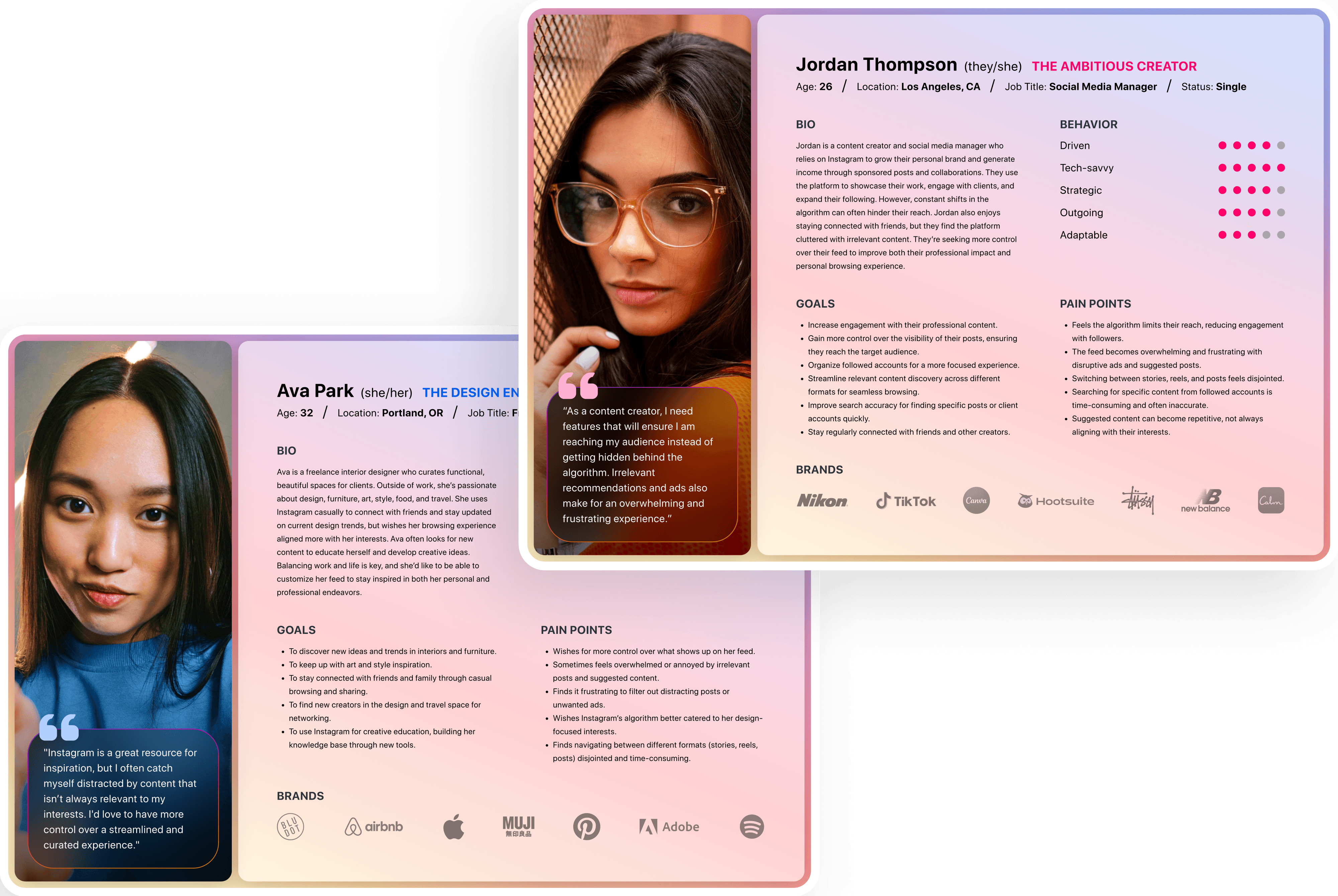
✦ User Personas
Personas were created based off the compiled data from the preliminary survey as well as user interviews. By also referencing my affinity map and coming up with "How Might We..." questions, I could better ensure I was addressing all the discoveries for user goals and issues in order to move forward with feature ideas.
✦ Ideation
Impactful ideas were generated within timed brainstorming sessions while focusing on solutions to enhance content curation and user control. By prioritizing feasibility and value, I explored ways to refine content personalization while maintaining user engagement. A feature roadmap was then developed in order to outline key functionalities and product requirements within the existing design constraints.

Design
✦ Interaction Design
🔷 Task Flows
By referencing the product roadmap and identifying the most urgent and feasible features, I approached task flows and their interactions in a linear fashion. As a result, I was able to move forward with wireframing without the need for additional user flows.
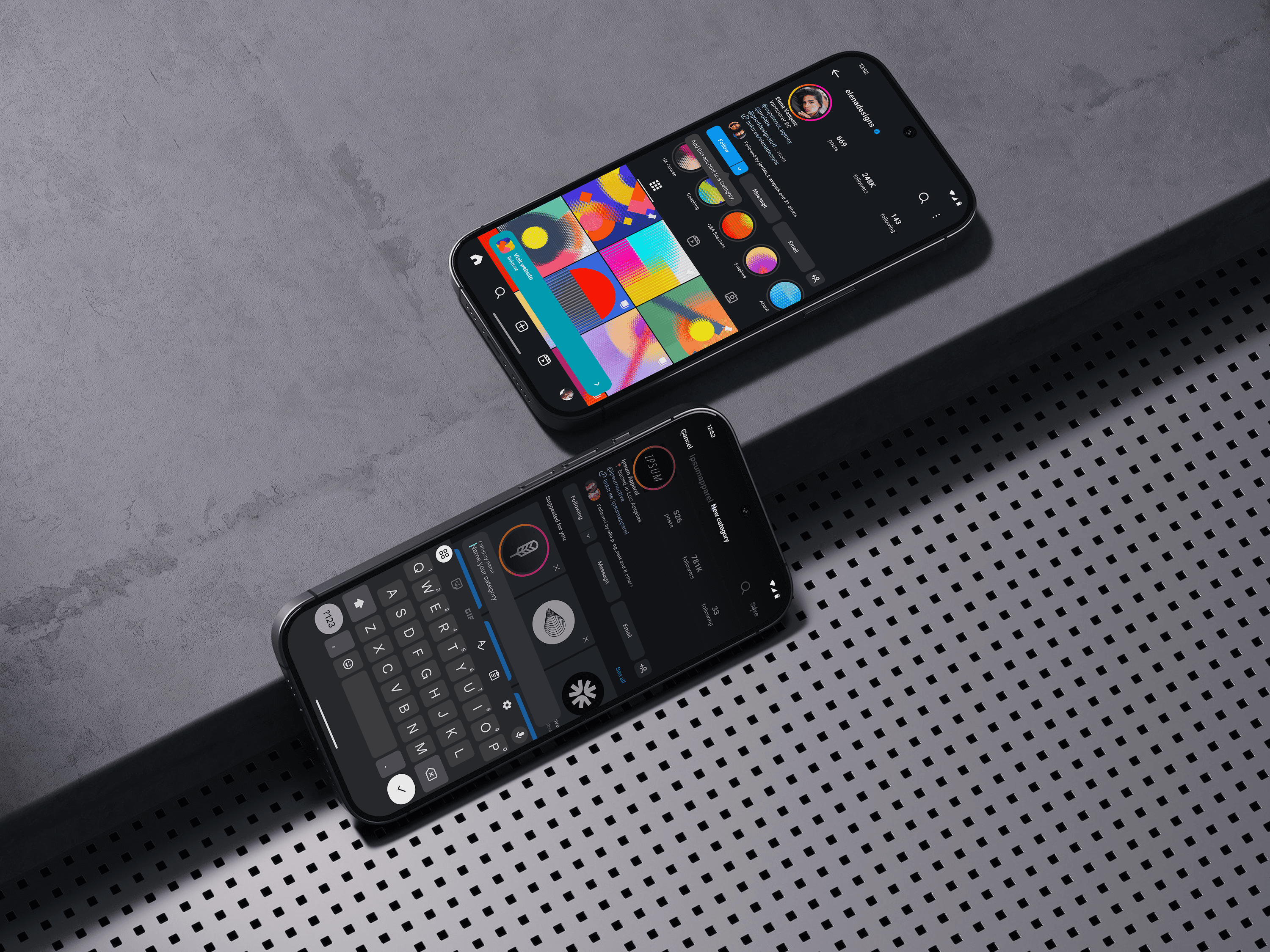
The primary feature that I would be focusing on was introducing "Categories". The design patterns used were pulled directly from the already existing Favorites and Collections features within Instagram. Additionally, I wanted to explore the ability to conduct a nested search within a specific user account.
Wireframe flows were taken on in detail, and were also handled linearly. I wanted to demonstrate the ability to complete specific tasks in a number of ways, where each flow would intuitively build on a method or task interaction that was introduced prior.
✦ Wireframes

✦ Brand Guidelines
System assets and mobile typography were taken directly from the Android OS version for this particular project. Instagram's brand colors were referenced from about.instagram.com/brand (which in itself is a delightful presentation that highlights the refresh of the brand).
✦ High Fidelity
The bulk of the project took place while making necessary tweaks and then adapting mid fidelity to high fidelity. Through applying color, dozens of visual assets, and microinteractions that implemented subtle motion within the app's existing context, the prototype provided a robust demonstration of the newly introduced features.
The Outcome


✦ Interactive Prototype
External link can be found HERE. (Required on tablet and mobile.)
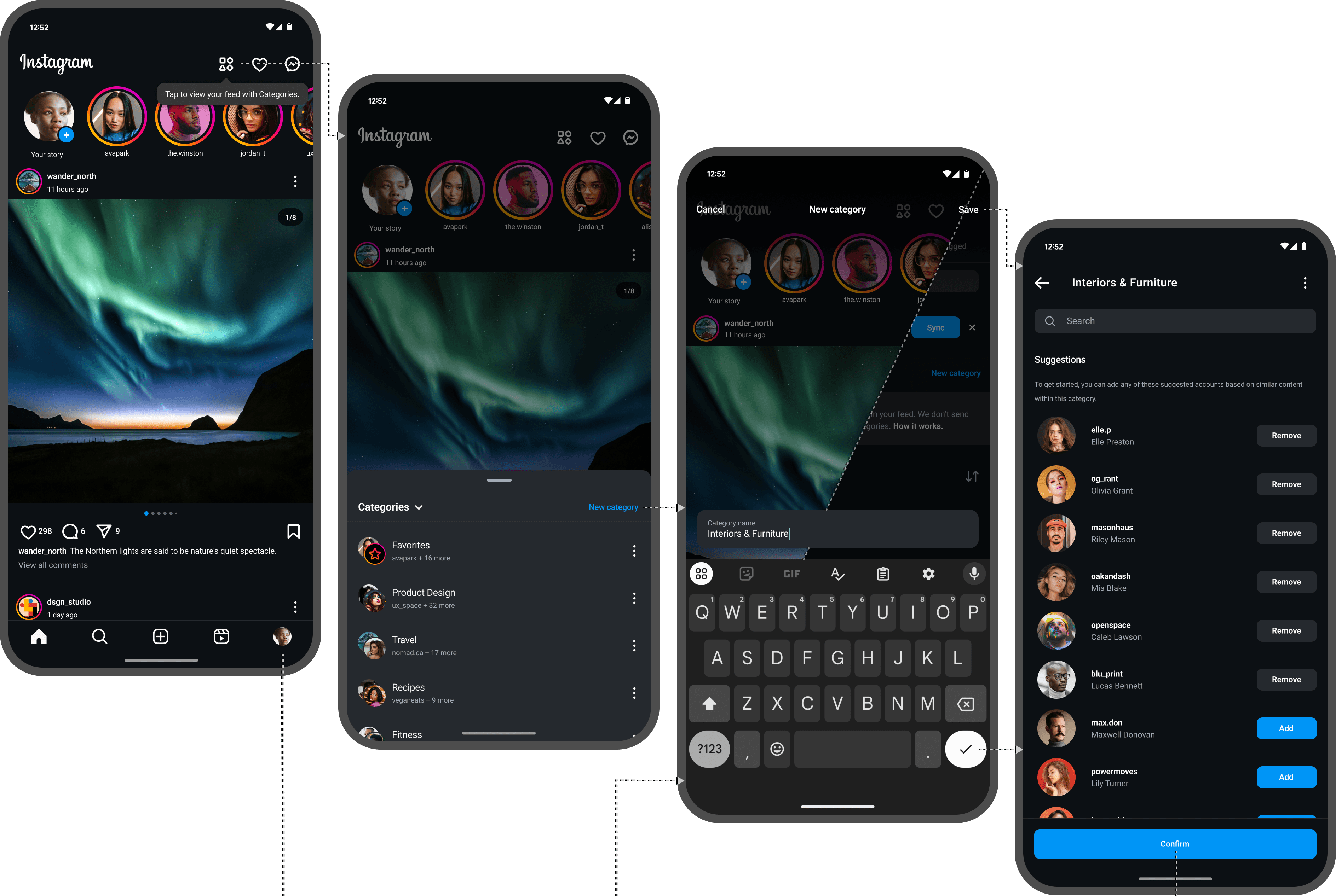
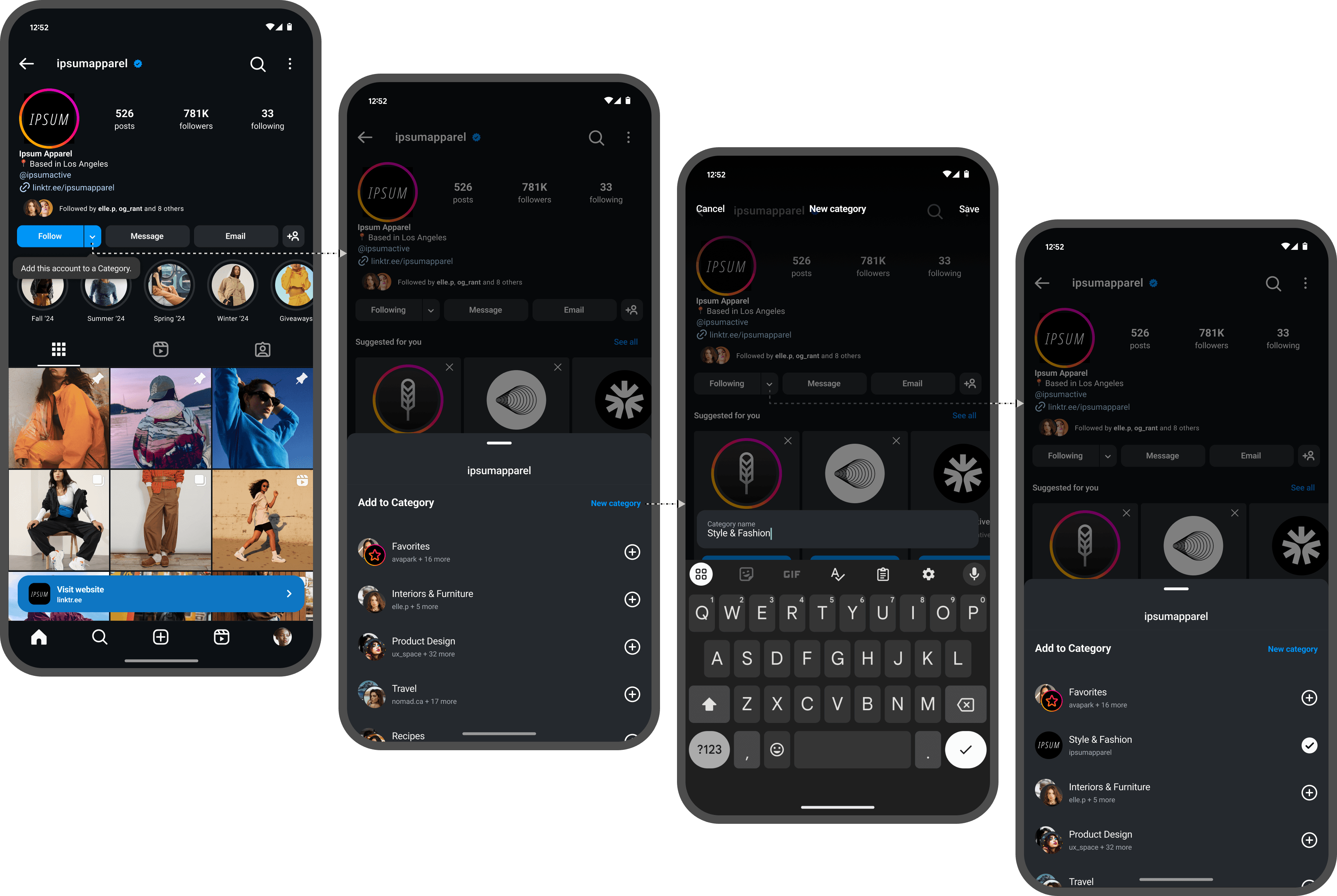
✦ Creating a Category & Filtering Your Feed
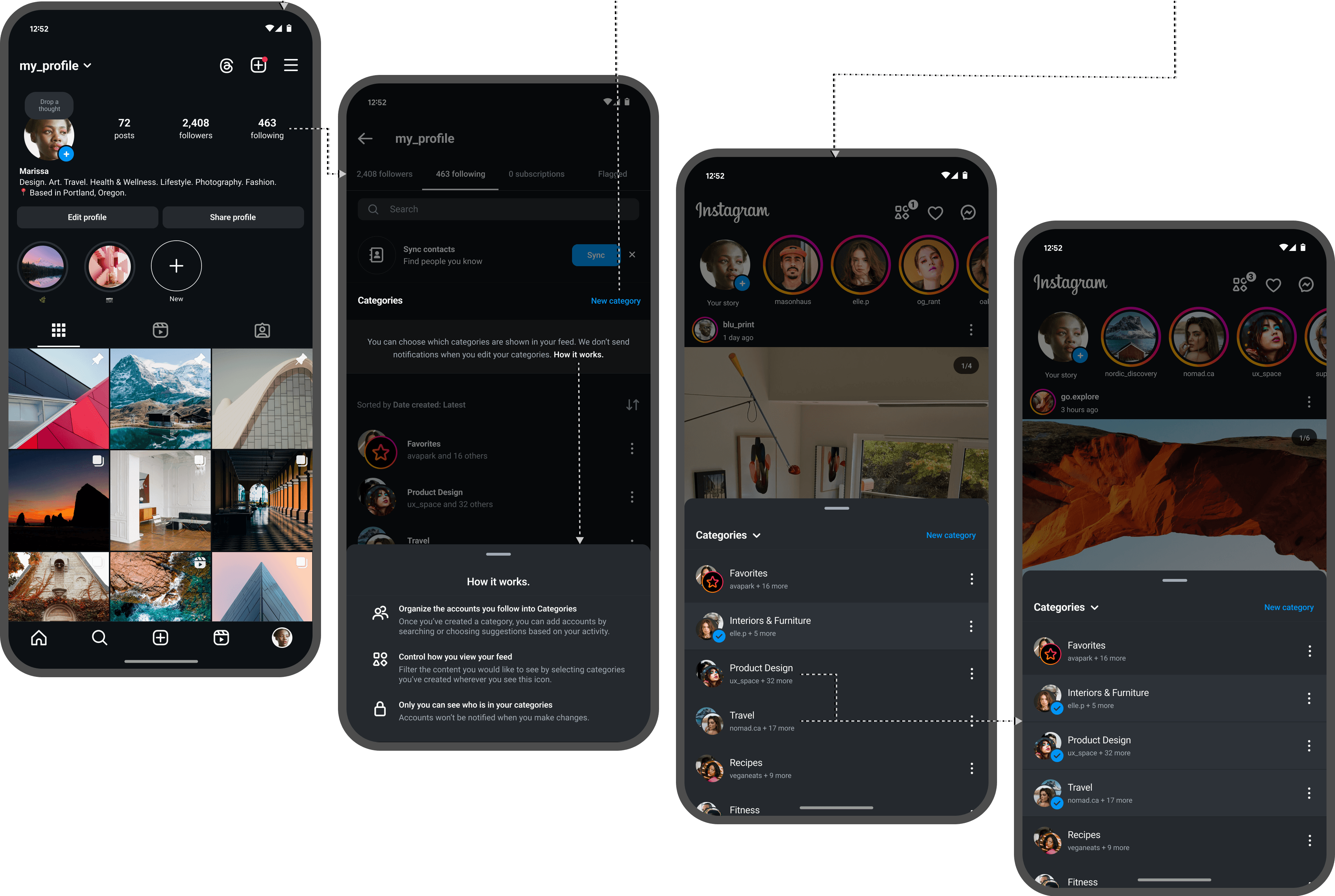
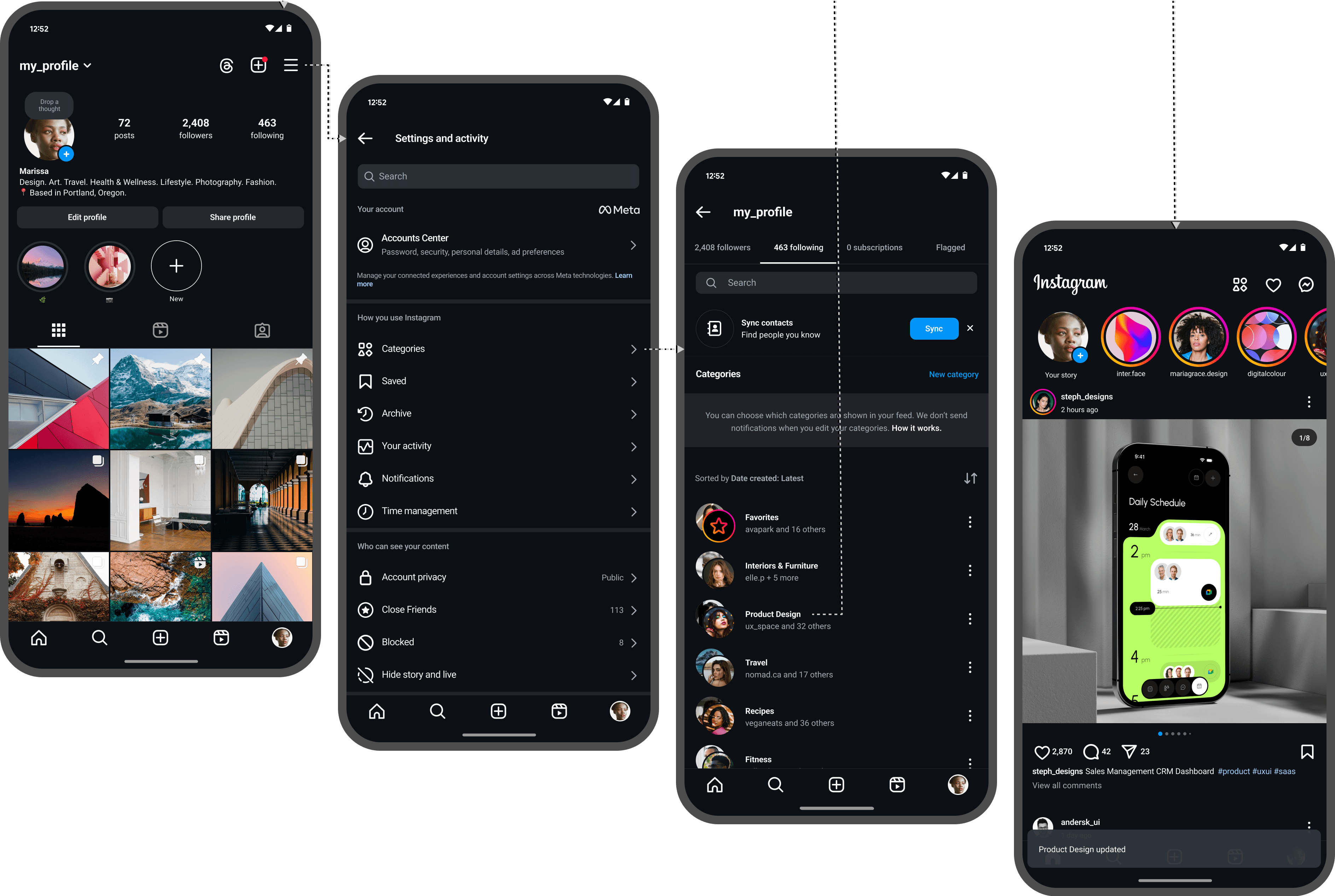
Upon the creation of a new category, one can then add accounts that they are already following to that category. This can easily be done anywhere the Category menu can be accessed, as well as by navigating to the accounts that you follow through your profile, or by accessing the settings menu. Multiple categories can then be selected to filter your feed.
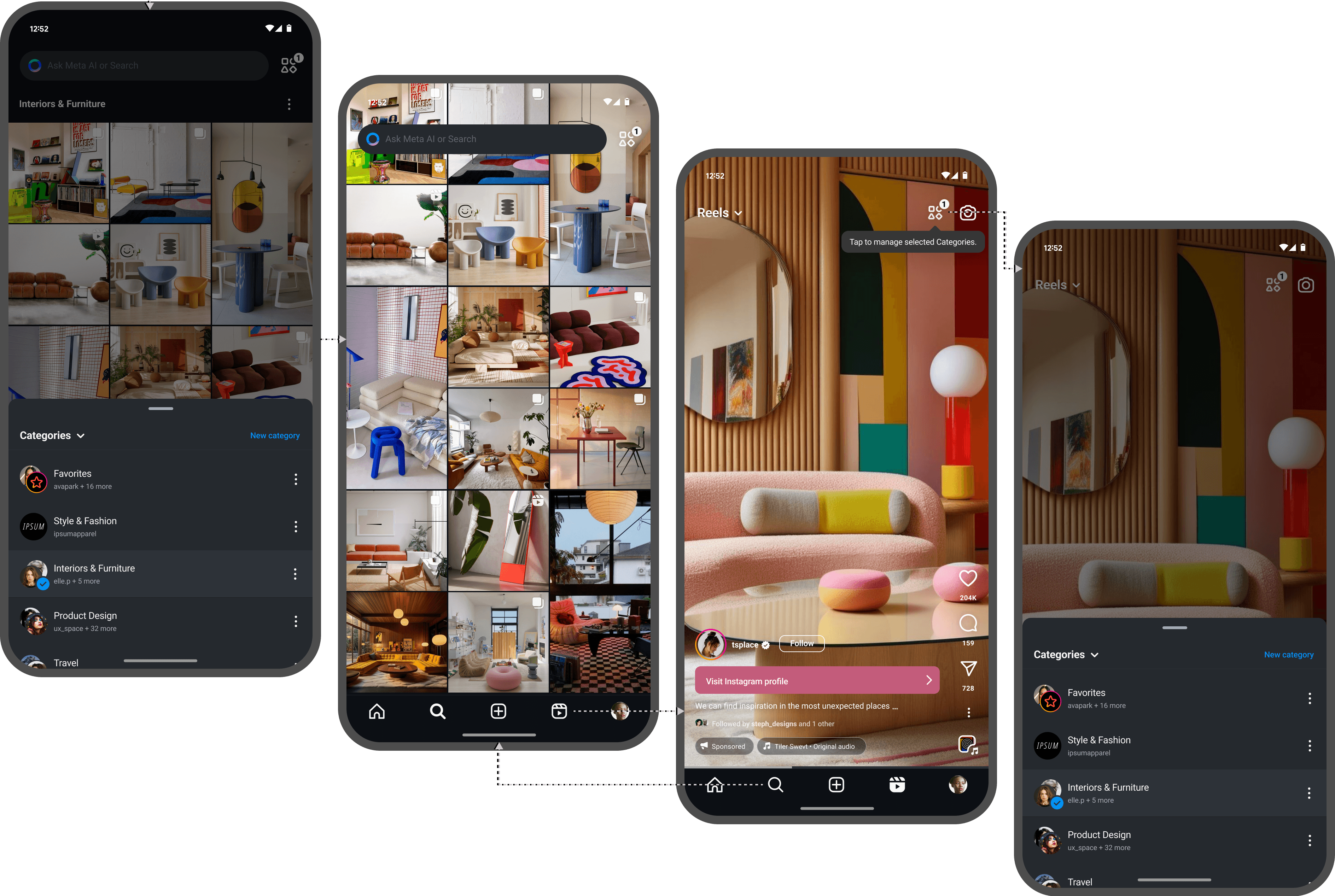
✦ Managing a Category
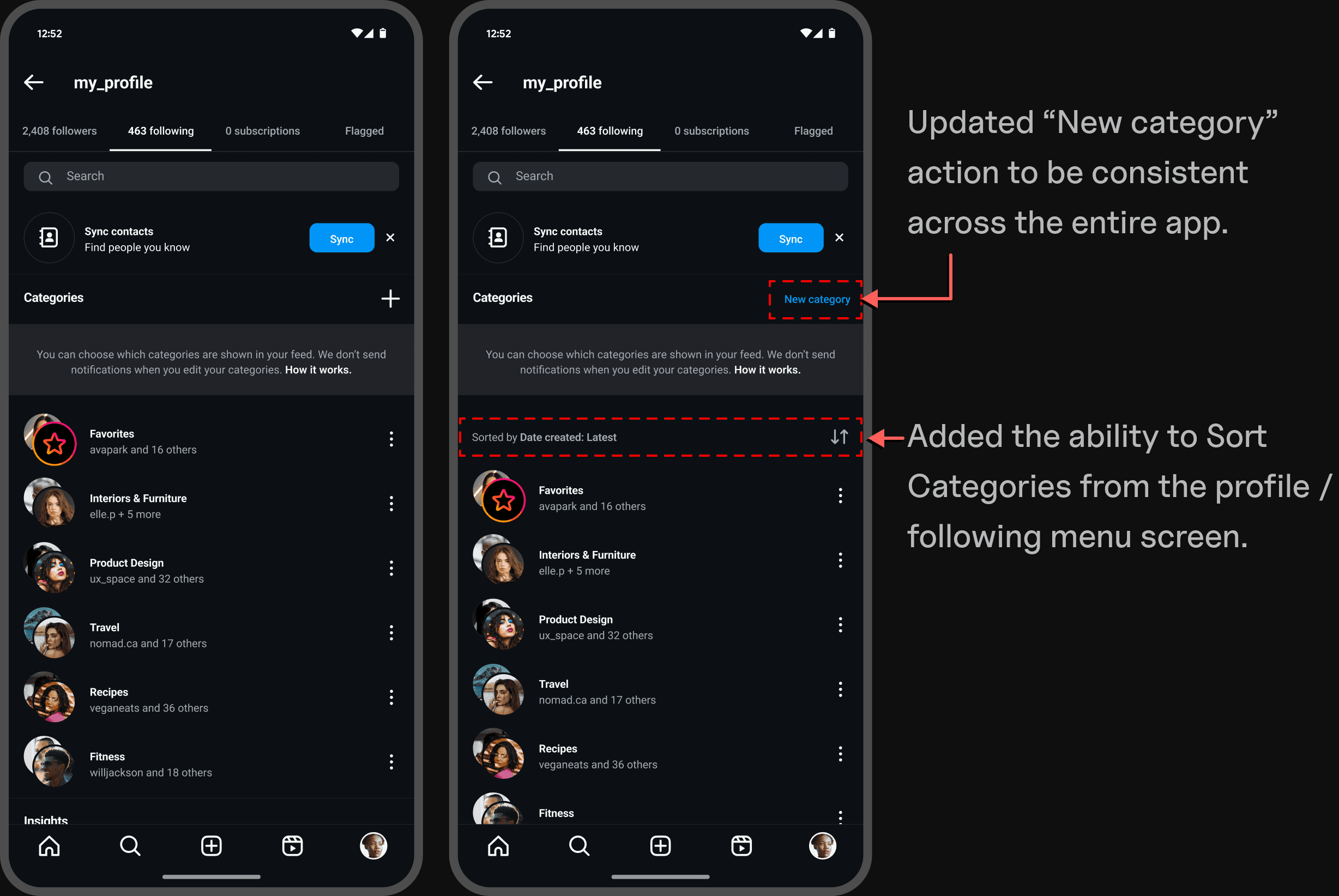
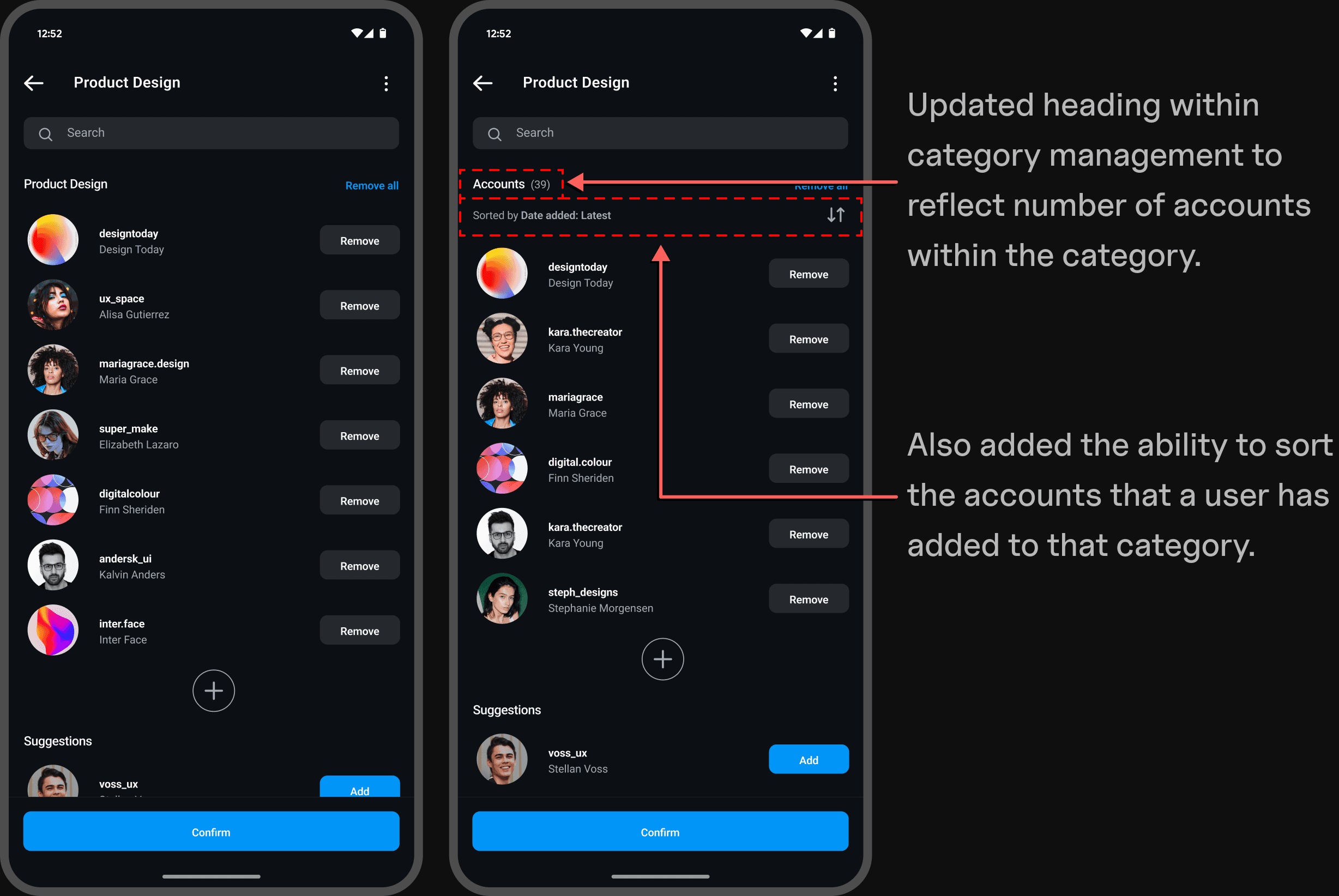
In the same way, this can again be accessed directly through the Category menu via the overflow icon for a particular category, or through your "Following" page or the settings menu. Users can easily search for, sort, add, or remove accounts from a category, as well as utlize suggestions provided.

✦ Following a New Account
It is easy to add a new account to a category upon following them directly from their profile page. The "Follow" button has been redesigned here to work as two separate buttons, where the dropdown chevron pulls up the ability to add to an existing category or conveniently create a new one (as well as all other preexisting actions). By simply tapping "Follow", one is not forced to access Category options.

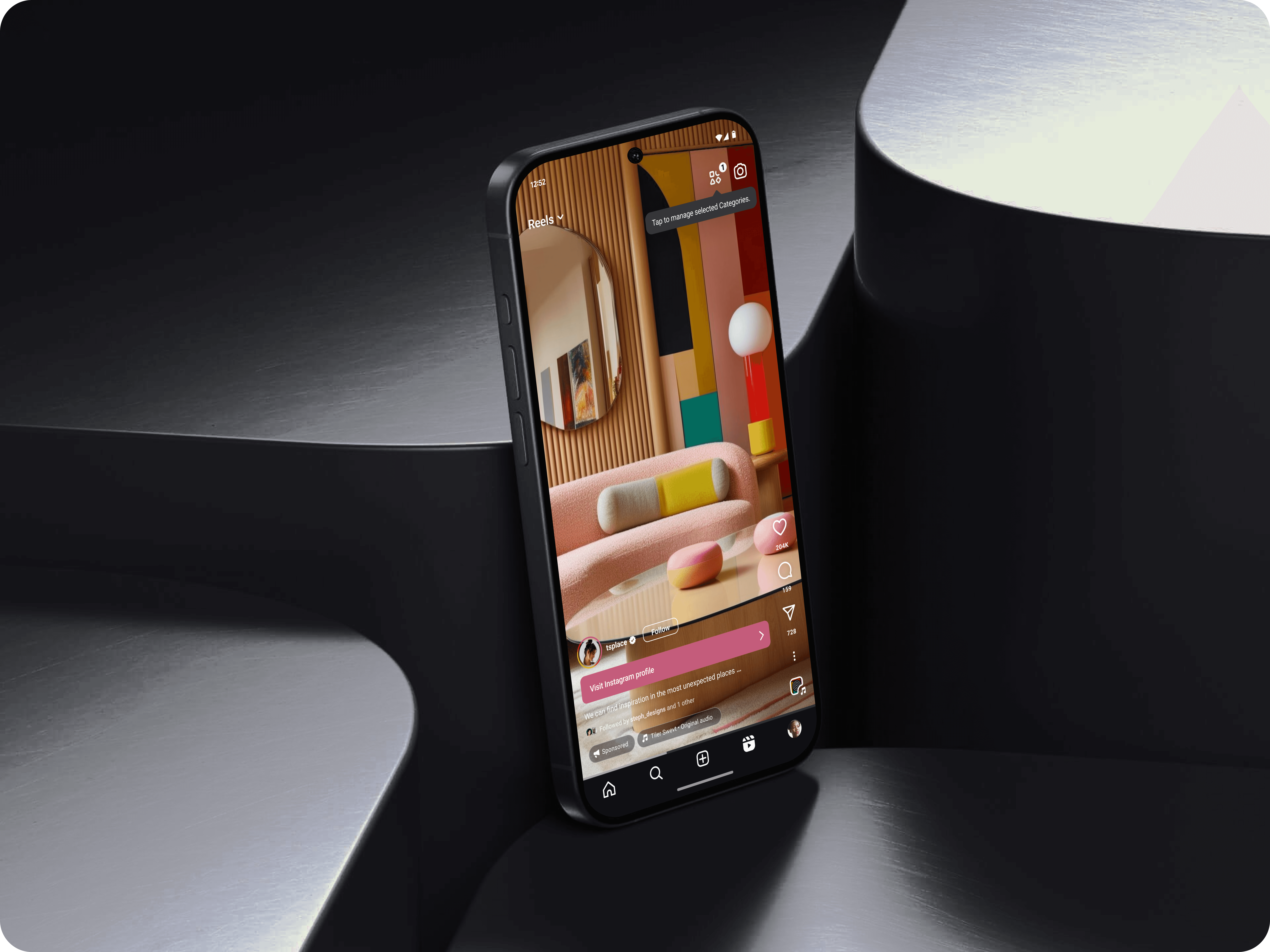
✦ Explore and Reels
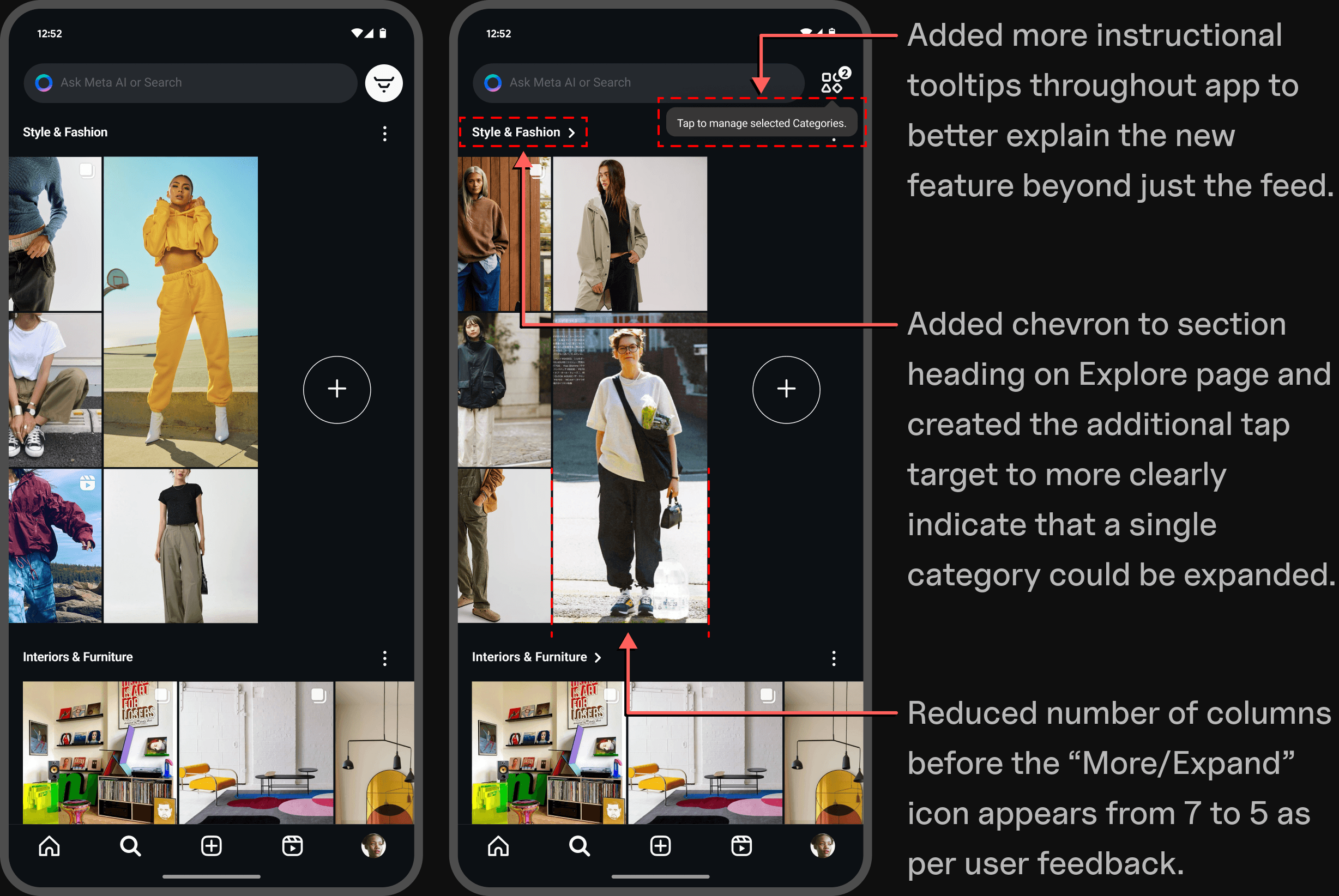
The Categories feature is also accessible on the Explore and Reels pages. Your intially category selections are carried over across the app, and can be managed from any of the pages. This lends itself to a more specified discovery experience. If two or more categories are selected on the Explore page, we see that Category sections take a horizontal scrolling orientation with a margin to create more visibility above the fold. If one or fewer categories are selected, the page reverts back to the app's current full-width vertical scrolling orientation. Expanding an individual category to "see more" also resumes back to vertical scrolling.

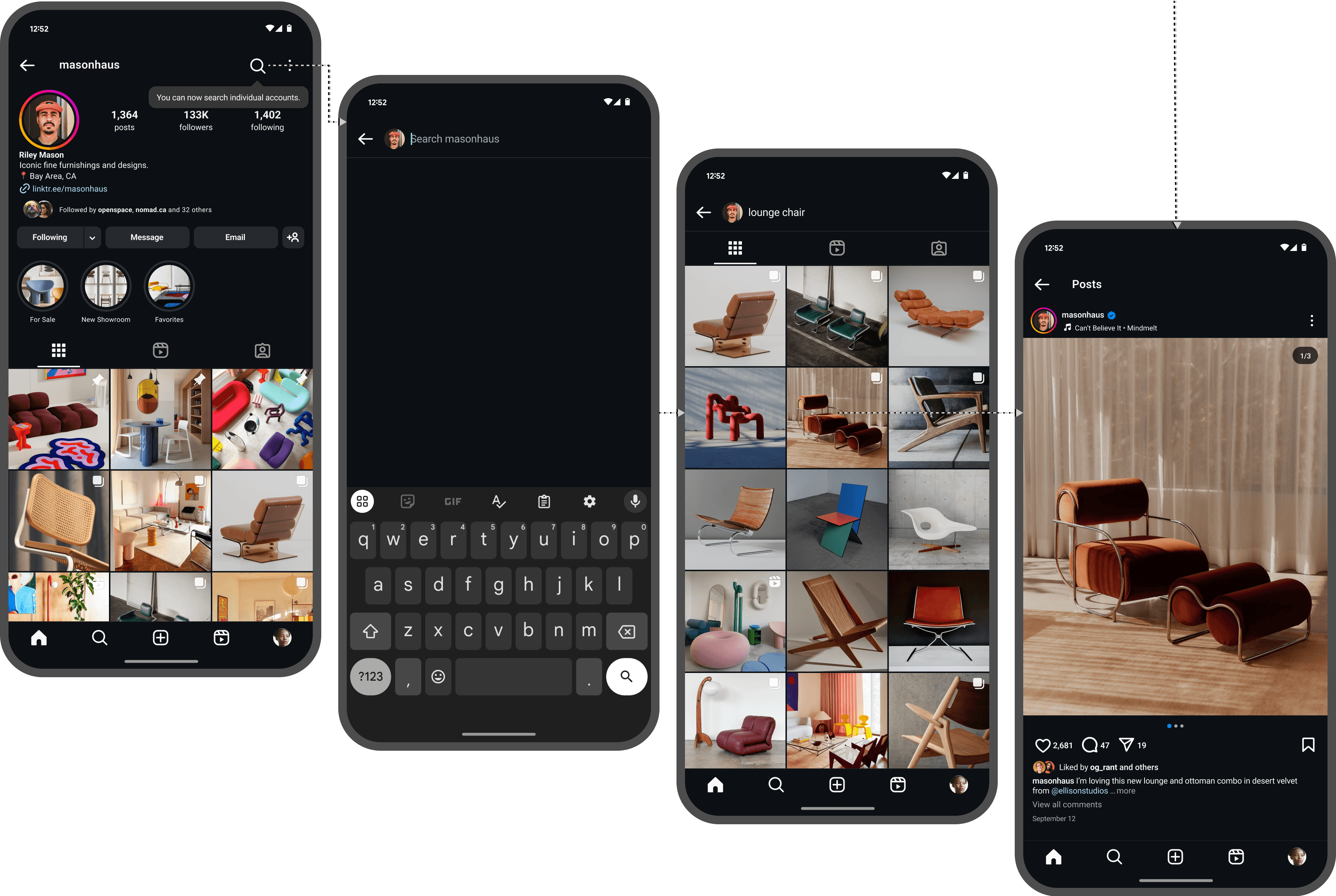
✦ A More Specified Search
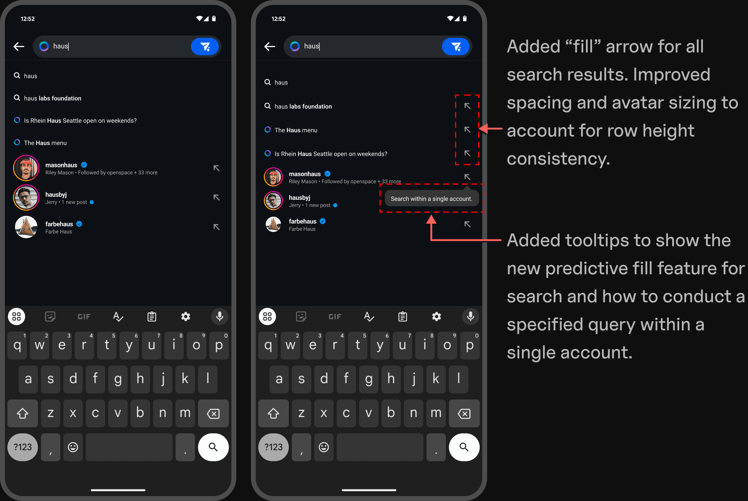
A secondary feature that has been implemented is the ability to search within a single account, or what I have referred to as a nested search. This can be done either from the search bar on the Explore page or directly from a user's account profile. An arrow icon has been added to all autocomplete search results to "fill" the search bar. This familiar design pattern additionally allows one to select an account, and continue typing a search query to search only within that account, complete with subtle animation. Instructional tooltips have been added throughout to inform users of the new feature.

Test
✦ Usability Testing
The prototype testing took place using Maze, where all sessions were moderated. This gave me the ability to gather heatmaps and quantitative feedback on task completion. User issues in common areas quickly became evident and aided with next steps on prioritizing final revisions.
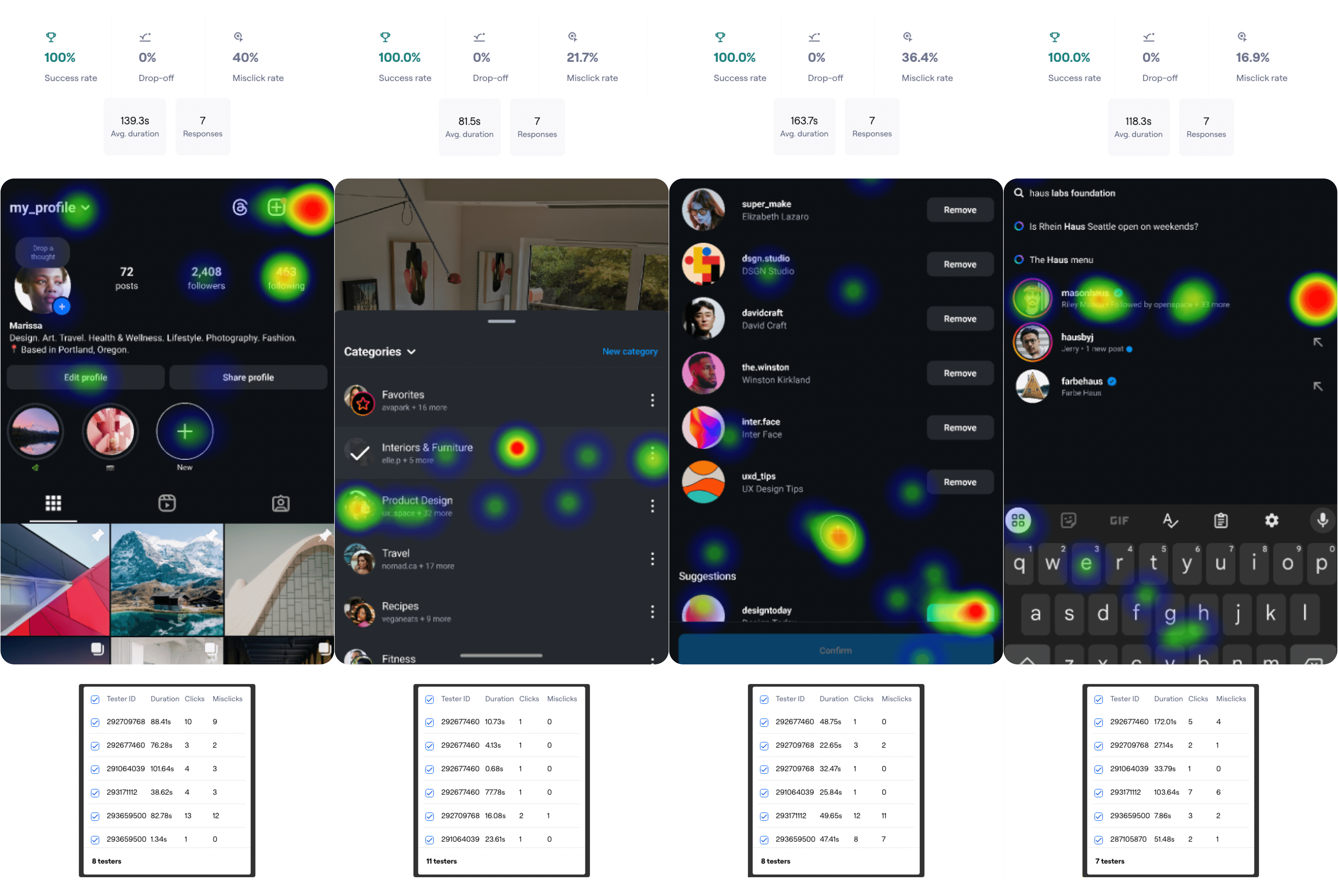
✦ Analyzing & Prioritizing Test Results
While reviewing notes, I accounted for overlap with any common issues from testing. Through both qualitative insights and metrics, a priority matrix was created in order to address the feasibility of iterations. These revisions would reduce cognitive strain and provide the most success for users to more efficiently complete tasks with less effort.


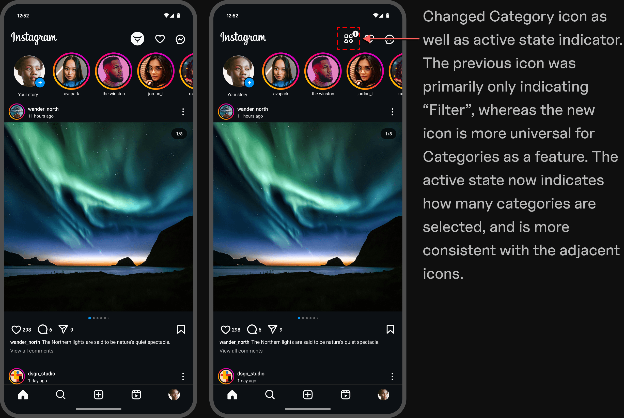
✦ Revise & Iterate


Wrapping Up
✦ Conclusion
By adding a feature to an existing product, this project provided valuable insights into the complexities of working within a large-scale platform with an established design system. By exploring ways to improve user control on Instagram, the process brought with it challenges associated with seamless feature integration, but ultimately led to an outcome with thoughtful solutions. For me, this project was a fresh take on creative problem-solving and iterating within tight constraints.
✦ Next Steps
As time allows, my future design plans for this project are as follows:
+ Option to reset algorithm preferences for suggested content
+ Focus Mode feature on Explore page
+ Swipe on ads or suggested posts based on relevance
+ In-app tutorial for all features
+ Paid subscriptions for ad removal
The newly designed "Categories" feature has the potential to boost engagement by giving users greater control over content curation, leading to a more focused and enjoyable browsing experience.
It reduces common frustrations with seeing unwanted content, making Instagram a more intentional and personalized platform. The value this creates is a result of increased participation and user satisfaction, translating to longer session durations and higher ad visibility, ultimately driving monetization. By aligning user needs with business goals, this feature helps balance content discovery with meaningful interactions, thusly producing a more rewarding outcome for both users and stakeholders.

Ryan Emmans 2025